
BlazeWidgetLayout - Android
The BlazeWidgetLayout class is a part of the BlazeSDK and is responsible for defining the layout properties and style of the widget items in a Blaze Widget (See more at Widgets.
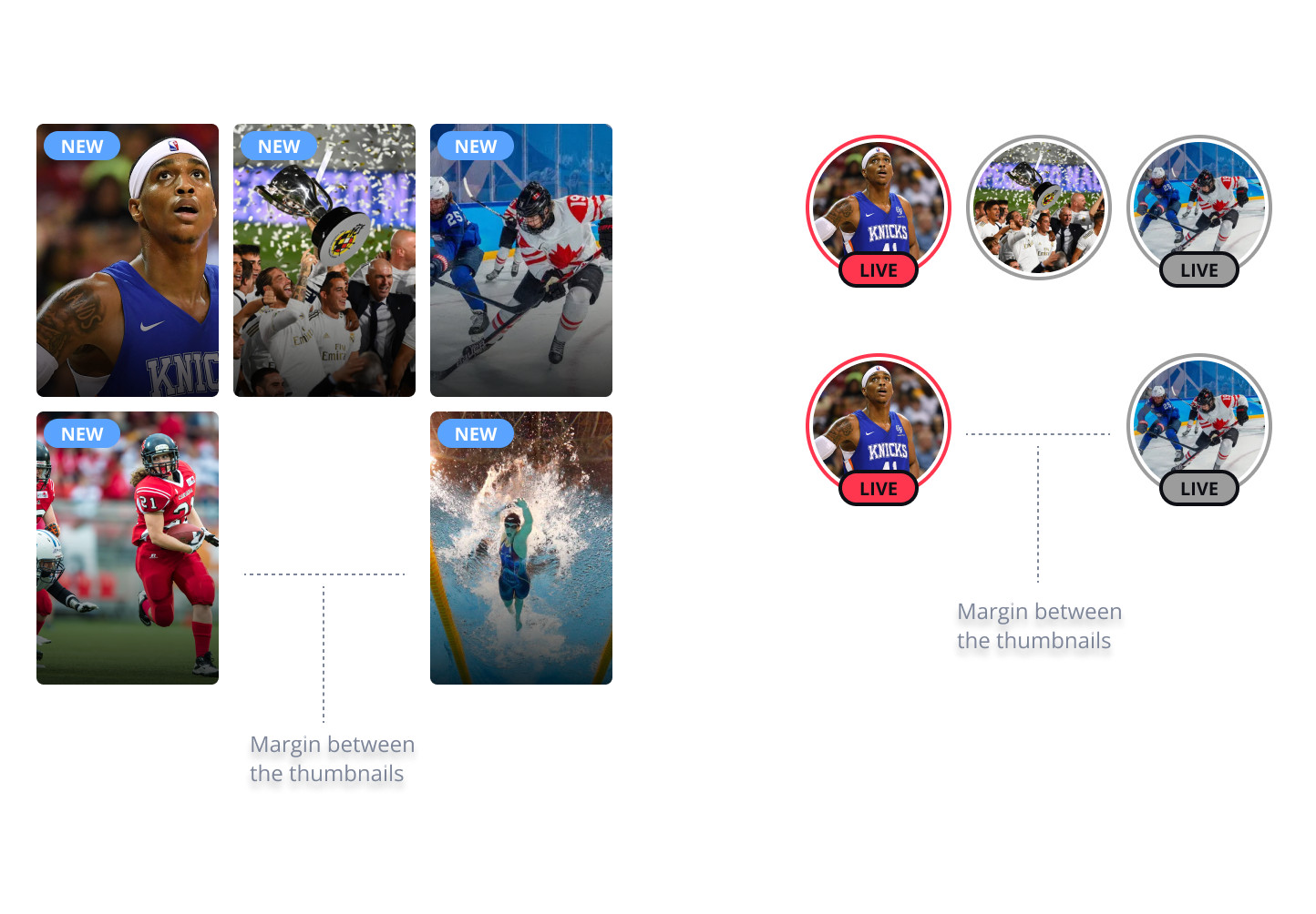
Properties
 horizontalItemsSpacing: BlazeDp,
 verticalItemsSpacing: BlazeDp,
 itemRatio: Float,
 margins: BlazeInsets,
 columns: Int,
 maxDisplayItemsCount: Int?,
 widgetItemStyle: BlazeWidgetItemStyle
horizontalItemsSpacing
Sets the horizontal spacing between items in the widget.
verticalItemsSpacing
Sets the vertical spacing between items.
Applies to Grid Widget only.
itemRatio
A Float representing the aspect ratio of the widget items. The default value is 2/3 (2:3 ratio). In row widgets, the height is fixed by the container, and the width is calculated based on the ratio. In grid widgets, the width is fixed by the container, and the height is dynamically calculated.
margins
Representing the space between the container and other items.
columns
An Int representing the number of columns in a grid layout.
The default value is 2.
Applies only for Grid Widget
maxDisplayItemsCount
An optional Int representing the maximum number of items allowed to be presented in the widget. If not given, an infinite number of items will be considered.
widgetItemStyle
A BlazeWidgetItemStyle object that defines the style settings for the widget items.
isScrollEnabled
is Horizontal Scroll allowed on widget.
Updated about 2 months ago