
Videos - Web
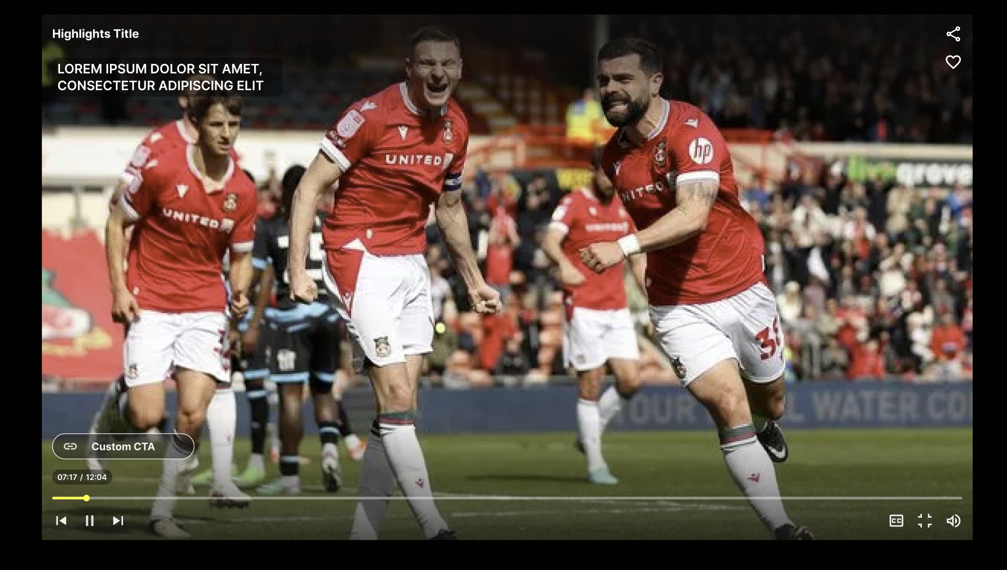
Videos Player Style
VideoPlayerStyle {
  backgroundColor: string;
  headingText: BlazeVideosPlayerHeadingTextStyle;
  buttons: BlazeVideosPlayerButtonsStyle;
  icons: BlazeVideoIconsStyle;
  cta: BlazeVideosPlayerCtaStyle;
  seekBar: BlazeVideosPlayerSeekBarStyle;
  captions?: BlazeVideosPlayerCaptionsStyle;
}
backgroundColor - string
Default color is #000000, type of string.
headingText - BlazeVideosPlayerHeadingTextStyle
BlazeVideosPlayerHeadingTextStyle, which includes different text styles for mobile, tablet, and desktop. Here’s how you can format it in a table:
BlazeVideosPlayerHeadingTextStyle = {
  textStyle: BlazeTextStyle;
  contentSource: 'TITLE';
  isVisible: boolean;
  font: string;
  textColor: string;
};

 BlazeTextStyle = {
  mobile: BlazeTextDeviceStyle;
  tablet: BlazeTextDeviceStyle;
  desktop: BlazeTextDeviceStyle;
};

BlazeTextDeviceStyle = {
  fontSize: string;
  fontWeight: FontWeightType;
  lineHeight?: string;
  letterSpacing?: string;
  textTransform?: TextTransformType;
};

FontWeightType = 'normal' | 'bold' | 'bolder' | 'lighter' | 'inherit' | 'initial' | 'unset' | '100' | '200' | '300' | '400' | '500' | '600' | '700' | '800' | '900';

TextTransformType = 'capitalize' | 'uppercase' | 'lowercase' | 'none';
Heading Text Style Table
| Property | Mobile | Tablet | Desktop |
|---|---|---|---|
| Font Size | 16px | 17px | 18px |
| Font Weight | 600 | 600 | 600 |
| Line Height | 1.5 | 1.5 | 1.5 |
| Letter Spacing | undefined | undefined | undefined |
| Text Transform | none | none | none |
| Font | Presets.playerFont | Presets.playerFont | Presets.playerFont |
| Text Color | #F0F0F0 | #F0F0F0 | #F0F0F0 |
| Content Source | TITLE | TITLE | TITLE |
| Is Visible | true | true | true |
Example Usage:
const headingTextConfig = {
  textStyle: {
    mobile: { fontSize: '16px', fontWeight: '600', textColor: '#F0F0F0' },
    tablet: { fontSize: '17px', fontWeight: '600', textColor: '#F0F0F0' },
    desktop: { fontSize: '18px', fontWeight: '600', textColor: '#F0F0F0' }
  },
};

myTheme.playerLayout.headingText = headingTextConfig;
buttons - BlazeVideosPlayerButtonsStyle
BlazeVideosPlayerButtonsStyle = {
  mute_unmute: BlazeButtonStyle;
  exit: BlazeButtonStyle;
  share: BlazeButtonStyle;
  like_unlike: BlazeButtonStyle;
  closed_captions: BlazeButtonStyle;
  audio_tracks?: BlazeButtonStyle;
  play_pause: BlazeButtonStyle;
  prev_next: BlazeButtonStyle;
  fullscreen: BlazeButtonStyle;
};

BlazeButtonStyle = {
  mobile: BlazeButtonDeviceStyle;
  tablet: BlazeButtonDeviceStyle;
  desktop: BlazeButtonDeviceStyle;
};

BlazeButtonDeviceStyle = {
  width: string;
  height: string;
  color: string;
  padding: string;
  isVisible: boolean;
  isEmbeddedVisible?: boolean;
  borderRadius: string;
  backgroundColor: string;
};
Buttons Style Table - default values
| Button Name | Device | Width | Height | Color | Padding | Visible | Border Radius | Background Color | Embedded Visible |
|---|---|---|---|---|---|---|---|---|---|
| Mute/Unmute | Mobile | 24px | 24px | #fff | 7px | ✅ | 4px | transparent | N/A |
| Tablet | 26px | 26px | #fff | 7px | ✅ | 4px | transparent | N/A | |
| Desktop | 28px | 28px | #fff | 7px | ✅ | 4px | transparent | N/A | |
| Exit | Mobile | 24px | 24px | #fff | 7px | ✅ | 4px | transparent | N/A |
| Tablet | 26px | 26px | #fff | 7px | ✅ | 4px | transparent | N/A | |
| Desktop | 28px | 28px | #fff | 7px | ❌ | 4px | transparent | N/A | |
| Share | Mobile | 24px | 24px | #fff | 7px | ✅ | 4px | transparent | N/A |
| Tablet | 26px | 26px | #fff | 7px | ✅ | 4px | transparent | N/A | |
| Desktop | 28px | 28px | #fff | 7px | ✅ | 4px | transparent | N/A | |
| Like/Unlike | Mobile | 24px | 24px | #ffd325 | 7px | ✅ | 4px | transparent | N/A |
| Tablet | 26px | 26px | #ffd325 | 7px | ✅ | 4px | transparent | N/A | |
| Desktop | 28px | 28px | #ffd325 | 7px | ✅ | 4px | transparent | N/A | |
| Play/Pause | Mobile | 38px | 38px | #fff | 12px | ✅ | 50% | rgba(0, 0, 0, 0.5) | N/A |
| Tablet | 42px | 42px | #fff | 12px | ✅ | 50% | rgba(0, 0, 0, 0.5) | N/A | |
| Desktop | 28px | 28px | #fff | 7px | ✅ | 4px | transparent | N/A | |
| Prev/Next | Mobile | 36px | 36px | #fff | 10px | ✅ | 50% | rgba(0, 0, 0, 0.5) | N/A |
| Tablet | 40px | 40px | #fff | 10px | ✅ | 50% | rgba(0, 0, 0, 0.5) | N/A | |
| Desktop | 28px | 28px | #fff | 7px | ✅ | 4px | transparent | N/A | |
| Closed Captions | Mobile | 24px | 24px | #fff | 7px | ✅ | 4px | transparent | ✅ |
| Tablet | 26px | 26px | #fff | 7px | ✅ | 4px | transparent | ✅ | |
| Desktop | 28px | 28px | #fff | 7px | ✅ | 4px | transparent | ✅ | |
| Audio tracks | Mobile | 24px | 24px | #fff | 7px | ✅ | 4px | transparent | ✅ |
| Tablet | 26px | 26px | #fff | 7px | ✅ | 4px | transparent | ✅ | |
| Desktop | 28px | 28px | #fff | 7px | ✅ | 4px | transparent | ✅ | |
| Fullscreen | Mobile | 24px | 24px | #fff | 7px | ✅ | 4px | transparent | N/A |
| Tablet | 26px | 26px | #fff | 7px | ✅ | 4px | transparent | N/A | |
| Desktop | 28px | 28px | #fff | 7px | ✅ | 4px | transparent | N/A |
Example Usage:
const buttonConfig = {
  buttonStyle: {
    mobile: { padding: '10px 20px', fontSize: '14px', backgroundColor: '#FF5733', color: '#FFFFFF' },
    tablet: { padding: '12px 24px', fontSize: '16px', backgroundColor: '#FF5733', color: '#FFFFFF' },
    desktop: { padding: '14px 28px', fontSize: '18px', backgroundColor: '#FF5733', color: '#FFFFFF' }
  },
};

myTheme.playerLayout.buttons.share = buttonConfig;
cta - BlazeVideosPlayerCtaStyle
BlazeVideosPlayerCtaStyle {
  borderRadius: string;
  text: BlazeTextStyle;
  fontFamily?: string;
  height: string;
  icon: BlazeVideosPlayerCtaIconStyle;
  visibility: BlazeVideoPlayerVisibility;
  borderColor: string;
  horizontalAlignment: ButtonPositionType;
  isVisible: boolean;
}

BlazeTextStyle = {
  mobile: BlazeTextDeviceStyle;
  tablet: BlazeTextDeviceStyle;
  desktop: BlazeTextDeviceStyle;
};

 BlazeTextDeviceStyle = {
  fontSize: string;
  fontWeight: FontWeightType;
  lineHeight?: string;
  letterSpacing?: string;
  textTransform?: TextTransformType;
};

FontWeightType = 'normal' | 'bold' | 'bolder' | 'lighter' | 'inherit' | 'initial' | 'unset' | '100' | '200' | '300' | '400' | '500' | '600' | '700' | '800' | '900';

TextTransformType = 'capitalize' | 'uppercase' | 'lowercase' | 'none';

BlazeVideoPlayerVisibility = {
  duration: number; // The duration in seconds for which the CTA will be visible after the overlay is hidden.
  behavior: CtaVisibilityBehavior; // The behavior of the CTA.
};

CtaVisibilityBehavior = 'AlwaysVisible' | 'VisibleAfterOverlayHidden';

ButtonPositionType = 'LEFT' | 'CENTER' | 'RIGHT';
CTA Configuration Default Values
| Property | Description | Default Value |
|---|---|---|
borderRadius | The corner radius of the CTA. | '20px' |
text | The text style for different devices. | See text style table below. |
fontFamily | The font family for the CTA text. | Presets.playerFont |
height | The height of the CTA. | '40px' |
icon | The icon style inside the CTA. | See icon style table below. |
visibility | The visibility behavior of the CTA. | See visibility table below. |
borderColor | The border color of the CTA. | '' (empty string) |
horizontalAlignment | The horizontal alignment of the CTA. | 'LEFT' |
isVisible | The visibility of the CTA. | true |
Text Style Default Values
| Device | Font Size | Font Weight | Line Height | Letter Spacing |
|---|---|---|---|---|
mobile | '16px' | '700' | '17px' | '' (empty) |
tablet | '16px' | '700' | '17px' | '' (empty) |
desktop | '16px' | '700' | '17px' | '' (empty) |
Icon Style Default Values
| Property | Description | Default Value |
|---|---|---|
position | The position of the icon inside the CTA. | 'START' |
color | The color of the icon. | '' (empty) |
size | The size of the icon. | '24px' |
isVisible | Whether the icon is visible. | true |
url | The URL of the icon image. | linkIconSvg |
Visibility Default Values
| Property | Description | Default Value |
|---|---|---|
duration | Duration the CTA is visible after the overlay is hidden. | 5000 (milliseconds) |
behavior | The behavior of the CTA visibility. | 'VisibleAfterOverlayHidden' |
Player Icons
BlazeVideoIconsStyle {
  play: string;
  pause: string;
  mute: string;
  unmute: string;
  share: string;
  exit: string;
  like: string;
  unlike: string;
  fullscreenEnter: string;
  fullscreenExit: string;
  closedCaptionsOn: string;
  closedCaptionsOff: string;
  headset?: string;
  navigation: {
    prevVideo: string;
    nextVideo: string;
  };
}
Icons and SVGs Table
| Icon Name | SVG Variable |
|---|---|
| Mute | muteIconSvg |
| Unmute | unmuteIconSvg |
| Exit | closeIconSvg |
| Share | shareIconSvg |
| Like | likeIconSvg |
| Unlike | unlikeIconSvg |
| Settings | settingsIconSvg |
| Play | playIconSvg |
| Pause | pauseIconSvg |
| Fullscreen Enter | fullscreenEnterIconSvg |
| Fullscreen Exit | fullscreenExitIconSvg |
| Closed Captions On | closedCaptionsOnIconSvg |
| Closed Captions Off | closedCaptionsOffIconSvg |
| Headset | headsetIconSvg |
| Prev Video | prevStoryIconSvg |
| Next Video | nextStoryIconSvg |
Example Usage:
BlazeVideosPlayerIconsStyle = {
  mute: `data:image/svg+xml;base64,${string}`;
  unmute: `data:image/svg+xml;base64,${string}`;
  exit: `data:image/svg+xml;base64,${string}`;
  share: `data:image/svg+xml;base64,${string}`;
  like: `data:image/svg+xml;base64,${string}`;
  unlike: `data:image/svg+xml;base64,${string}`;
  setting: `data:image/svg+xml;base64,${string}`;
  play: `data:image/svg+xml;base64,${string}`;
  pause: `data:image/svg+xml;base64,${string}`;
  fullscreenEnter: `data:image/svg+xml;base64,${string}`;
  fullscreenExit: `data:image/svg+xml;base64,${string}`;
  closedCaptionsOn: `data:image/svg+xml;base64,${string}`;
  closedCaptionsOff: `data:image/svg+xml;base64,${string}`;
  headset: `data:image/svg+xml;base64,${string}`;
  navigation: {
    prevVideo: `data:image/svg+xml;base64,${string}`;
    nextVideo: `data:image/svg+xml;base64,${string}`;
  };
};
buttons -BlazeVideosPlayerButtonsStyle
| Button Name | Device | Width | Height | Padding | Visibility | Border Radius | Background Color |
|---|---|---|---|---|---|---|---|
| Mute/Unmute | Mobile | 24px | 24px | 7px | ✅ | — | — |
| Tablet | 26px | 26px | 7px | ✅ | — | — | |
| Desktop | 28px | 28px | 7px | ✅ | — | — | |
| Exit | Mobile | 24px | 24px | 7px | ✅ | — | — |
| Tablet | 26px | 26px | 7px | ✅ | — | — | |
| Desktop | 28px | 28px | 7px | ❌ | — | — | |
| Share | Mobile | 24px | 24px | 7px | ✅ | — | — |
| Tablet | 26px | 26px | 7px | ✅ | — | — | |
| Desktop | 28px | 28px | 7px | ✅ | — | — | |
| Like/Unlike | Mobile | 24px | 24px | 7px | ✅ | — | — |
| Tablet | 26px | 26px | 7px | ✅ | — | — | |
| Desktop | 28px | 28px | 7px | ✅ | — | — | |
| Play/Pause | Mobile | 38px | 38px | 12px | ✅ | 50% | rgba(51,51,51,0.9) |
| Tablet | 42px | 42px | 12px | ✅ | 50% | rgba(51,51,51,0.9) | |
| Desktop | 28px | 28px | 7px | ✅ | — | — | |
| Prev/Next | Mobile | 36px | 36px | 10px | ✅ | 50% | rgba(51,51,51,0.9) |
| Tablet | 40px | 40px | 10px | ✅ | 50% | rgba(51,51,51,0.9) | |
| Desktop | 28px | 28px | 7px | ✅ | 0 | — | |
| Closed Captions | Mobile | 24px | 24px | 7px | ✅ | — | — |
| Tablet | 26px | 26px | 7px | ✅ | — | — | |
| Desktop | 28px | 28px | 7px | ✅ | — | — | |
| Audio tracks | Mobile | 24px | 24px | 7px | ✅ | — | — |
| Tablet | 26px | 26px | 7px | ✅ | — | — | |
| Desktop | 28px | 28px | 7px | ✅ | — | — | |
| Fullscreen | Mobile | 24px | 24px | 7px | ✅ | — | — |
| Tablet | 26px | 26px | 7px | ✅ | — | — | |
| Desktop | 28px | 28px | 7px | ✅ | — | — |
Example Usage:
const iconStyles = {
  muteUnmute: {
    mobile: { isVisible: true, width: '22px', height: '22px', padding: '10px' },
    tablet: { isVisible: true, width: '22px', height: '22px', padding: '10px' },
    desktop: { isVisible: true, width: '25px', height: '25px', padding: '10px' }
  }
};
Seek Bar Configuration - BlazeVideosPlayerSeekBarStyle
BlazeVideosPlayerSeekBarStyle {
  isVisible: boolean;
  verticalMargin: string;
  horizontalMargin: string;
  playingState: BlazeSeekBarStyle;
  pausedState: BlazeSeekBarStyle;
}

BlazeSeekBarStyle = {
  isVisible: boolean;
  isThumbVisible: boolean;
  backgroundColor: string;
  progressColor: string;
  bufferProgressColor?: string;
  height: string;
  borderRadius: string;
  thumbColor: string;
  thumbSize: string;
};
Seek Bar - General Properties
| Property | Value |
|---|---|
| isVisible | true |
| verticalSpacing | '20px' |
| horizontalSpacing | '15px' |
Seek Bar - Playing State - BlazeSeekBarStyle
| Property | Value |
|---|---|
| isVisible | true |
| isThumbVisible | false |
| backgroundColor | Colors.Gray |
| progressColor | Colors.White |
| height | '3px' |
| borderRadius | '5px' |
| thumbColor | '' (empty) |
| thumbSize | '0px' |
Seek Bar - Paused State - BlazeSeekBarStyle
| Property | Value |
|---|---|
| isVisible | true |
| isThumbVisible | true |
| backgroundColor | Colors.Gray |
| progressColor | Colors.White |
| height | '5px' |
| borderRadius | '5px' |
| thumbColor | Colors.White |
| thumbSize | '15px' |
Example Usage:
const seekBar = {
  isVisible: true,
  bottomSpacing: '20px',
  playingState: {
    isVisible: true,
    backgroundColor: '#808080',
    progressColor: '#FFFFFF',
    height: '3px',
    isThumbVisible: false
  }
};
captions - BlazeVideosPlayerCaptionsStyle
This property is optional on VideoPlayerStyle. You can omit it when you construct style objects, and you should read it defensively from returned theme objects.
Use this to customize the appearance and placement of closed captions in the inline video player.
BlazeVideosPlayerCaptionsStyle {
  font?: string;
  fontSize?: string;
  fontWeight?: FontWeightType;
  positioning?: {
    horizontal?: 'start' | 'center';
    vertical?: 'top' | 'center' | 'bottom';
  };
}
Captions properties
| Property | Type | Supported values |
|---|---|---|
font | string | Any valid font family |
fontSize | string | Any valid CSS font size |
fontWeight | FontWeightType | Standard font weight values |
positioning.horizontal | string | start, center |
positioning.vertical | string | top, center, bottom |
Captions Default Values
| Property | Description | Default Value |
|---|---|---|
font | The font family for the captions text. | '"Inter", sans-serif' |
fontWeight | The font weight for the captions text. | '700' |
positioning.horizontal | The horizontal alignment of the captions. | 'start' |
positioning.vertical | The vertical alignment of the captions. | 'top' |
Example Usage:
myTheme.playerStyle.captions = {
  font: "'Roboto', sans-serif",
  fontSize: '16px',
  fontWeight: '700',
  positioning: {
    horizontal: 'center',
    vertical: 'bottom'
  }
};
statusIndicator - BlazeVideosPlayerStatusIndicatorStyle
The status indicator appears in the video player header showing the current stream state: LIVE, UPCOMING, or ENDED.
BlazeVideosPlayerStatusIndicatorStyle {
  isVisible: boolean;
  padding: string;
  position: BlazeVideosPlayerStatusIndicatorPositionStyle;
  containerStyle?: BlazeVideosPlayerStatusIndicatorContainerStyle;
  streamStates: {
    upcoming: IndicatorStyle;
    live: IndicatorStyle;
    ended: IndicatorStyle;
  };
  upcomingDateStyle: IndicatorStyle;
}

BlazeVideosPlayerStatusIndicatorPositionStyle {
  top: string;
  left: string;
  right: string;
}

BlazeVideosPlayerStatusIndicatorContainerStyle {
  gap?: string;
  alignItems?: string;
  display?: string;
}

IndicatorStyle {
  backgroundColor: string;
  textColor: string;
  text: string;
  textSize: string;
  font: string;
  fontWeight?: FontWeightType;
  borderRadius: string;
  borderWidth: number;
  borderColor: string;
  padding: string;
  letterSpacing: string;
  isVisible: boolean;
  icon?: {
    url: string; // Base64-encoded SVG: data:image/svg+xml;base64,${string}
    color?: string;
    size?: string;
  };
}
Basic Configuration
// Enable/disable status indicator
myVideoTheme.playerStyle.statusIndicator.isVisible = true;

// Position in player (top-left corner by default)
myVideoTheme.playerStyle.statusIndicator.position.top = '16px';
myVideoTheme.playerStyle.statusIndicator.position.left = '16px';
myVideoTheme.playerStyle.statusIndicator.position.right = 'auto';

// Padding around the indicator
myVideoTheme.playerStyle.statusIndicator.padding = '8px';
Customize LIVE State
myVideoTheme.playerStyle.statusIndicator.streamStates.live.backgroundColor = '#FF0000';
myVideoTheme.playerStyle.statusIndicator.streamStates.live.textColor = '#FFFFFF';
myVideoTheme.playerStyle.statusIndicator.streamStates.live.text = 'LIVE';
myVideoTheme.playerStyle.statusIndicator.streamStates.live.textSize = '12px';
myVideoTheme.playerStyle.statusIndicator.streamStates.live.font = "'Roboto', sans-serif";
myVideoTheme.playerStyle.statusIndicator.streamStates.live.fontWeight = 'bold';
myVideoTheme.playerStyle.statusIndicator.streamStates.live.borderRadius = '4px';
myVideoTheme.playerStyle.statusIndicator.streamStates.live.borderWidth = 0;
myVideoTheme.playerStyle.statusIndicator.streamStates.live.borderColor = '#FFFFFF';
myVideoTheme.playerStyle.statusIndicator.streamStates.live.padding = '4px 12px';
myVideoTheme.playerStyle.statusIndicator.streamStates.live.letterSpacing = '0.5px';
myVideoTheme.playerStyle.statusIndicator.streamStates.live.isVisible = true;

// Optional: Add custom icon
myVideoTheme.playerStyle.statusIndicator.streamStates.live.icon = {
  url: 'data:image/svg+xml;base64,PHN2ZyB3aWR0aD0iMTIiIGhlaWdodD0iMTIiLz4=',
  color: '#FFFFFF',
  size: '12px'
};
Customize UPCOMING State
myVideoTheme.playerStyle.statusIndicator.streamStates.upcoming.backgroundColor = '#9C9C9C';
myVideoTheme.playerStyle.statusIndicator.streamStates.upcoming.textColor = '#FFFFFF';
myVideoTheme.playerStyle.statusIndicator.streamStates.upcoming.text = 'UPCOMING';
myVideoTheme.playerStyle.statusIndicator.streamStates.upcoming.textSize = '12px';
myVideoTheme.playerStyle.statusIndicator.streamStates.upcoming.font = "'Roboto', sans-serif";
myVideoTheme.playerStyle.statusIndicator.streamStates.upcoming.borderRadius = '4px';
myVideoTheme.playerStyle.statusIndicator.streamStates.upcoming.padding = '4px 12px';
myVideoTheme.playerStyle.statusIndicator.streamStates.upcoming.letterSpacing = '0.5px';
myVideoTheme.playerStyle.statusIndicator.streamStates.upcoming.isVisible = true;

// Optional: Add custom icon (base64-encoded SVG)
myVideoTheme.playerStyle.statusIndicator.streamStates.upcoming.icon = {
  url: 'data:image/svg+xml;base64,PHN2ZyB3aWR0aD0iMTIiIGhlaWdodD0iMTIiLz4=',
  color: '#FFFFFF',
  size: '12px'
};
Customize ENDED State
myVideoTheme.playerStyle.statusIndicator.streamStates.ended.backgroundColor = '#666666';
myVideoTheme.playerStyle.statusIndicator.streamStates.ended.textColor = '#FFFFFF';
myVideoTheme.playerStyle.statusIndicator.streamStates.ended.text = 'ENDED';
myVideoTheme.playerStyle.statusIndicator.streamStates.ended.textSize = '12px';
myVideoTheme.playerStyle.statusIndicator.streamStates.ended.font = "'Roboto', sans-serif";
myVideoTheme.playerStyle.statusIndicator.streamStates.ended.borderRadius = '4px';
myVideoTheme.playerStyle.statusIndicator.streamStates.ended.padding = '4px 12px';
myVideoTheme.playerStyle.statusIndicator.streamStates.ended.letterSpacing = '0.5px';
myVideoTheme.playerStyle.statusIndicator.streamStates.ended.isVisible = true;

// Optional: Add custom icon (base64-encoded SVG)
myVideoTheme.playerStyle.statusIndicator.streamStates.ended.icon = {
  url: 'data:image/svg+xml;base64,PHN2ZyB3aWR0aD0iMTIiIGhlaWdodD0iMTIiLz4=',
  color: '#FFFFFF',
  size: '12px'
};
Upcoming Date/Time Display
Shows countdown timer for upcoming streams:
myVideoTheme.playerStyle.statusIndicator.upcomingDateStyle.textColor = '#FFFFFF';
myVideoTheme.playerStyle.statusIndicator.upcomingDateStyle.textSize = '11px';
myVideoTheme.playerStyle.statusIndicator.upcomingDateStyle.font = "'Roboto', sans-serif";
myVideoTheme.playerStyle.statusIndicator.upcomingDateStyle.padding = '2px 0 0 0';
myVideoTheme.playerStyle.statusIndicator.upcomingDateStyle.backgroundColor = 'transparent';
myVideoTheme.playerStyle.statusIndicator.upcomingDateStyle.isVisible = true;
Optional: Inline Position (Next to Title)
Position the status indicator inline with the video title instead of absolutely positioned:
myVideoTheme.playerStyle.statusIndicator.containerStyle = {
  display: 'flex',
  gap: '12px',
  alignItems: 'center'
};
backToLiveButton - BlazeVideosPlayerBackToLiveButtonStyle
The back-to-live button appears during live streams, allowing viewers to return to the live edge when they've scrubbed backward into DVR (Digital Video Recording) content.
BlazeVideosPlayerBackToLiveButtonStyle {
  margins: string;
  padding: string;
  playbackStates: {
    atLiveEdgeState: BlazeVideosPlayerBackToLiveButtonStateStyle;
    behindLiveState: BlazeVideosPlayerBackToLiveButtonStateStyle;
  };
}

BlazeVideosPlayerBackToLiveButtonStateStyle {
  text: string;
  textColor: string;
  textSize: string;
  font: string;
  backgroundColor: string;
  borderRadius: string;
  icon?: {
    url: string; // Base64-encoded SVG: data:image/svg+xml;base64,${string}
    color?: string;
  };
}
Button States
- At Live Edge: Shows "LIVE" indicator (passive, non-clickable)
- Behind Live: Shows "Back to Live" button (clickable, returns to live edge)
Configuration
Example Usage:
// Margins and padding apply to both states
myTheme.playerStyle.backToLiveButton.margins = '0 16px 16px 0';
myTheme.playerStyle.backToLiveButton.padding = '8px 16px';

// Customize "At Live Edge" state (passive indicator)

myTheme.playerStyle.backToLiveButton.playbackStates.atLiveEdgeState.text = 'LIVE';
myTheme.playerStyle.backToLiveButton.playbackStates.atLiveEdgeState.textColor = '#FFFFFF';
myTheme.playerStyle.backToLiveButton.playbackStates.atLiveEdgeState.textSize = '13px';
myTheme.playerStyle.backToLiveButton.playbackStates.atLiveEdgeState.font = "'Roboto', sans-serif";
myTheme.playerStyle.backToLiveButton.playbackStates.atLiveEdgeState.backgroundColor = 'rgba(255, 0, 0, 0.9)';
myTheme.playerStyle.backToLiveButton.playbackStates.atLiveEdgeState.borderRadius = '20px';

// Customize "Behind Live" state (clickable button)
myTheme.playerStyle.backToLiveButton.playbackStates.behindLiveState.text = 'Back to Live';
myTheme.playerStyle.backToLiveButton.playbackStates.behindLiveState.textColor = '#FFFFFF';
myTheme.playerStyle.backToLiveButton.playbackStates.behindLiveState.textSize = '13px';
myTheme.playerStyle.backToLiveButton.playbackStates.behindLiveState.backgroundColor = 'rgba(0, 0, 0, 0.7)';
myTheme.playerStyle.backToLiveButton.playbackStates.behindLiveState.borderRadius = '20px';
Button Behavior:
- Automatically appears in bottom-right corner during live playback
- Shows "LIVE" indicator when viewer is at the live edge
- Changes to "Back to Live" button when viewer scrubs backward
- Clicking returns viewer to live edge with smooth transition
- Hidden for VOD content and ended streams without DVR
Live Stream Seek Bar Behavior
The seek bar works the same as documented above in the Seek Bar Configuration section, but has special behavior for live streams:
- Progress bar fills from left (oldest DVR content) to right (live edge)
- Thumb appears when scrubbing backward from live edge
- Thumb automatically hidden when at live edge
- DVR window length determined by backend configuration
- User can scrub backward to review recent moments
Example Usage:
// Customize seek bar for live streams (use red color)
myTheme.playerStyle.seekBar.playingState.progressColor = '#FF0000';
myTheme.playerStyle.seekBar.playingState.thumbColor = '#FF0000';
myTheme.playerStyle.seekBar.pausedState.progressColor = '#FF0000';
myTheme.playerStyle.seekBar.pausedState.thumbColor = '#FFFFFF';
Multi-audio
When a stream offers more than one audio track (for example, commentary in different languages), the video player shows an audio track button with a headset icon in the bottom-right controls. Viewers select it to open the Commentary audio menu and pick a track. Main marks the stream's default track.
Button Behavior:
- Appears only for stream videos (live streams, and ended streams that play back as a recording) whose HLS stream has two or more audio tracks
- Hidden for regular VOD videos, upcoming streams, and streams with a single audio track
- Available in the video player and in
WidgetEmbeddedVideo; not in the Stories or Moments players - Lists tracks in the order the stream defines them, using the stream's track names
- Saves the viewer's choice in the browser's local storage and applies it by track name to later streams, including after a page reload
Multi-audio is on by default. To turn it off in every video player, pass shouldAllowMultiAudio: false to Initialize. See BlazeSDK class.
To hide or restyle the button for one widget, use buttons.audio_tracks and icons.headset in that widget's theme. In WidgetEmbeddedVideo, the button shows only when both isVisible and isEmbeddedVisible are true. If you replace audio_tracks with your own object, set isEmbeddedVisible: true to keep the button in the embedded player.
Example Usage:
const myTheme = BlazeSDK.Theme('row-rectangle', 'video');
const audioTracks = myTheme.playerStyle.buttons.audio_tracks;

if (audioTracks) {
  // Hide the button in the embedded player only
  audioTracks.mobile.isEmbeddedVisible = false;
  audioTracks.tablet.isEmbeddedVisible = false;
  audioTracks.desktop.isEmbeddedVisible = false;

  // Change the button color on desktop
  audioTracks.desktop.color = '#FFD325';
}

// Replace the headset icon (base64-encoded SVG)
myTheme.playerStyle.icons.headset = 'data:image/svg+xml;base64,...';
The menu itself (its colors, title, and the Main label) can't be customized.
Default Values: Live Streaming Components
Status Indicator Defaults
| Property | Value |
|---|---|
| isVisible | true |
| padding | '8px' |
| position.top | '16px' |
| position.left | '16px' |
| position.right | 'auto' |
Live State Defaults
| Property | Value |
|---|---|
| backgroundColor | '#FF0000' |
| textColor | '#FFFFFF' |
| text | 'LIVE' |
| textSize | '12px' |
| borderRadius | '4px' |
| padding | '4px 12px' |
| isVisible | true |
Upcoming State Defaults
| Property | Value |
|---|---|
| backgroundColor | '#9C9C9C' |
| textColor | '#FFFFFF' |
| text | 'UPCOMING' |
| textSize | '12px' |
| borderRadius | '4px' |
| padding | '4px 12px' |
| isVisible | true |
Ended State Defaults
| Property | Value |
|---|---|
| backgroundColor | '#666666' |
| textColor | '#FFFFFF' |
| text | 'ENDED' |
| textSize | '12px' |
| borderRadius | '4px' |
| padding | '4px 12px' |
| isVisible | true |
Back-to-Live Button Defaults
| Property | Value |
|---|---|
| margins | '0 16px 16px 0' |
| padding | '8px 16px' |
At Live Edge State Defaults
| Property | Value |
|---|---|
| text | 'LIVE' |
| textColor | '#FFFFFF' |
| textSize | '13px' |
| backgroundColor | 'rgba(255, 0, 0, 0.9)' |
| borderRadius | '20px' |
Behind Live State Defaults
| Property | Value |
|---|---|
| text | 'Back to Live' |
| textColor | '#FFFFFF' |
| textSize | '13px' |
| backgroundColor | 'rgba(0, 0, 0, 0.7)' |
| borderRadius | '20px' |
Updated 8 days ago