
Widget
Widget and BlazeSDK Theme Interface
To achieve a personalized design for your widget and player, pass it as a parameter in the widgetView create function to unleash the potential of customization.
BlazeSDK has an intuitive interface that grants access to a range of pre-defined presets. If no parameter is provided, the SDK gracefully defaults to the Blaze preset, ensuring a seamless experience for users.
For illustrative purposes, let's delve into customizing the "row-circle" preset. To initiate this customization, invoke the Theme function and pass the desired preset as a parameter.
const myRowCircleTheme = BlazeSDK.Theme('row-circle','story')Available Presets:
- row-circle
- row-circle-animated
- row-rectangle
- grid-2-columns
- grid-3-columns
- row-rectangle-horizontal
- row-rectangle-animated
- grid-2-columns-horizontal
- grid-3-columns-horizontal
Animated presets: row-circle-animated and row-rectangle-animated show animated GIF thumbnails in a row widget. One item animates at a time (the first fully visible item, or the item under the pointer on desktop). The other items show their GIF's poster (its first frame), so the animation starts and stops on the same frame. Items without a poster show their static thumbnail. row-circle-animated supports stories, moments, and videos. row-rectangle-animated supports moments, videos, and stories (shown as portrait tiles). To turn animation off while keeping the preset's layout, see Animated thumbnails.
Pro Tip: If you plan to display a grid with dimensions 2x2 or 2x3, we highly recommend utilizing the grid presets for optimal visual appeal.
After successfully creating a new theme object, you have the liberty to tailor the appearance of the layoutStyle and playerStyle. The layoutStyle object encompasses all the style properties of the widget, while the playerStyle object encompasses those of the story player.
Here's an example of how your circleRowTheme object may look like:
{
    "columns": 0,
    "horizontalItemsSpacing": 12,
    "verticalItemsSpacing": 12,
    "lines": 2,
    "wordBreak": "break-word",
    "labelStyle": {
      "isVisible": true,
      "gap": 8,
      "width": "auto",
      "color": "#F8F9FB",
      "padding": "0px",
      "position": "outsideUnder",
      "font": "'Roboto', 'SF Pro Text', 'Open Sans'",
      "fontSize": "14px",
      "fontWeight": "bold"
    },
    "borderWidth": 2,
    "borderRadius": "100%",
    "borderPadding": 2,
    "statusLiveStyle": {
      "backgroundColor": "#9C9C9C",
      "textColor": "#F8F9FB",
      "font": "'Roboto', 'SF Pro Text', 'Open Sans'",
      "textSize": "10px",
      "borderRadius": "14px",
      "borderWidth": 2,
      "borderColor": "#F8F9FB",
      "text": "LIVE",
      "isVisible: true,
      "thumbnailBorderColor: ''
    },
    "statusLiveUnreadStyle": {
      "backgroundColor": "#FF364E",
      "textColor": "#F8F9FB",
      "font": "'Roboto', 'SF Pro Text', 'Open Sans'",
      "textSize": "10px",
      "letterSpacing": "initial",
      "borderRadius": "14px",
      "borderWidth": 2,
      "borderColor": "#F8F9FB",
      "text": "LIVE",
      "isVisible: true,
			"thumbnailBorderColor: ''
    },
    "statusReadStyle": {
      "backgroundColor": "#9C9C9C",
      "textColor": "#F8F9FB",
      "font": "'Roboto', 'SF Pro Text', 'Open Sans'",
      "textSize": "10px",
      "letterSpacing": "initial",
      "borderRadius": "14px",
      "borderWidth": 2,
      "borderColor": "#F8F9FB",
      "isVisible: true,
      "thumbnailBorderColor: ''
    },
    "statusUnreadStyle": {
      "backgroundColor": "#5AA3FF",
      "textColor": "#F8F9FB",
      "font": "'Roboto', 'SF Pro Text', 'Open Sans'",
      "textSize": "10px",
      "borderRadius": "14px",
      "borderWidth": 2,
      "borderColor": "#F8F9FB",
      "text": "NEW"
      "isVisible: true,
      "thumbnailBorderColor: ''
    },
    "badgeIndicatorStyle": {
      "backgroundColor": "",
      "backgroundImage": "",
      "textColor": "#F8F9FB",
      "font": "'WSC Open Sans'",
      "textSize": "10px",
      "letterSpacing": "initial",
      "borderRadius": "50%",
      "borderWidth": 2,
      "borderColor": "#F8F9FB",
      "padding": "0",
      "text": "",
      "isVisible": false,
      "width": 24,
      "height": 24
    },
    "badgePosition": "outsideTopRight",
    "statusIndicatorPosition": "outsideBottom"
  }
We will dive in each one of them, and provide examples on how to use them
Widget Layout Style Customization
BlazeSDK's theme interface offers easy and efficient customization options for your widget's layout style. You can structure and tailor the following components:
- Label / Title: Customize the title name of your widget to match your design preferences.
- Item Spacing: Control the spacing between individual items for a clean and organized layout.
- Borders: Define and modify borders for distinct visual elements within the widget.
- Statuses: Use different visual cues to display and style statuses for widget items.
These customization features ensure your widget aligns perfectly with your brand's identity and provides an engaging user experience.
If you need further assistance or additional information on widget layout style customization, feel free to ask. We're here to help you achieve a professional and effective web SDK documentation.
Label / Title
1.a. Hide or display the story title
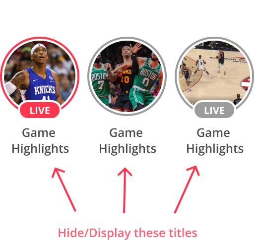
myRowCircleTheme.layoutStyle.labelStyle.isVisible = true // <Boolean>1.b. Modify the title's color
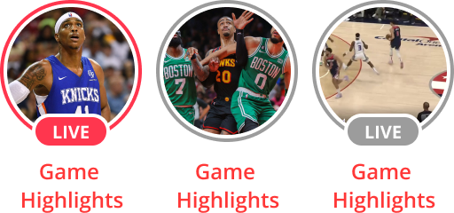
myRowCircleTheme.layoutStyle.labelStyle.color = '#FF0000' // Red <String>1.c. Modify the background title's color.
myRowCircleTheme.layoutStyle.labelStyle.backgroundColor = 'linear-gradient(rgba(0, 0, 0, 0), rgb(0, 0, 0))'
myRowCircleTheme.layoutStyle.labelStyle.backgroundColor = 'transparent' // Hide the title's background
1.d. Modify the title's font size and font-family.
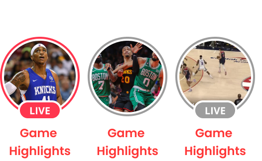
myRowCircleTheme.layoutStyle.labelStyle.fontSize = '10px' // <String>
myRowCircleTheme.layoutStyle.labelStyle.font = 'popp' // <String>
1.e Modify the padding around the title and the gap between the items and the title
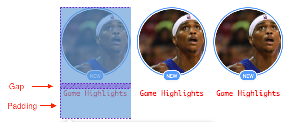
myRowCircleTheme.layoutStyle.labelStyle.gap = 10 // <Number>
myRowCircleTheme.layoutStyle.labelStyle.padding = '0px 0px 40px 0px' // <String>
1.f Change the location of title
Widget Layout Recommendations with BlazeSDK Theme Interface
Based on the type of widget you are designing, we recommend selecting specific layout options to optimize the visual presentation:
- Row Circle/Rectangle: For widgets with a row circle or rectangle layout, it is advisable to use the 'outsideAbove' or 'outsideUnder' positioning. This choice ensures a more aesthetically pleasing arrangement of elements.
- Grid: When dealing with grid-based widgets, we suggest utilizing the 'outsideLeft' or 'outsideRight' positioning. This layout approach complements the grid structure and enhances the overall user experience.
By aligning the layout with the widget type, you can create a harmonious design that maximizes usability and visual appeal.
** Not all positions are currently supported for each preset.
| Value | Description |
|---|---|
| insideTopLeft | Inside the thumbnail top left |
| insideTopRight | Inside the thumbnail top right |
| insideTop | Inside the thumbnail top middle |
| insideMiddleLeft | Inside the thumbnail middle left |
| insideMiddleRight | Inside the thumbnail middle left |
| insideMiddle | Inside the thumbnail middle center |
| insideBottomLeft | Inside the thumbnail bottom left |
| insideBottomRight | Inside the thumbnail bottom right |
| insideBottom | Inside the thumbnail middle center |
| outsideTopLeft | Outside and above the thumbnail on the left |
| outsideTopRight | Outside and above the thumbnail on the right |
| outsideTop | Outside and above the thumbnail centered |
| outsideBottomLeft | Outside and below the thumbnail on the left |
| outsideBottomRight | Outside and below the thumbnail on the right |
| outsideBottom | Outside and below the thumbnail centered |
| outsideLeft | Outside the thumbnail, left side |
| outsideRight | Outside the thumbnail, right side |
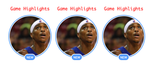
myRowCircleTheme.layoutStyle.labelStyle.position = 'outsideAbove' / 'outsideUnder' // // <String> Code provided so far in the documentation:
document.addEventListener("onBlazeSDKConnect", () => {
  const circleRowTheme = BlazeSDK.Theme('row-circle')
  circleRowTheme.layoutStyle.labelStyle.color = '#FF0000'
  circleRowTheme.layoutStyle.labelStyle.fontSize = '10px'
  circleRowTheme.layoutStyle.labelStyle.font = 'Monaco'
  circleRowTheme.layoutStyle.labelStyle.gap = 10
  circleRowTheme.layoutStyle.labelStyle.padding = '0px 0px 5px 0px'
  circleRowTheme.layoutStyle.labelStyle.position = 'outsideTop'

  const widgetRowView = BlazeSDK.WidgetRowView('<CONTAINER_ID>', {
    labels: ['<LABEL_NAME>'],
    theme: circleRowTheme
  })
});
Item Spacing
1.a Change in the horizontal items spacing
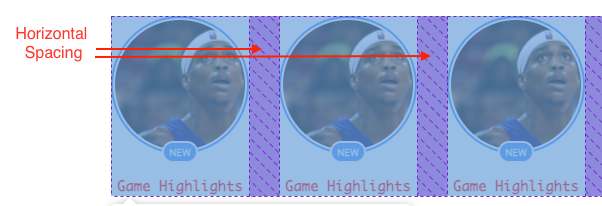
myRowCircleTheme.layoutStyle.horizontalItemsSpacing = 30 // <Number>1.b Change in the vertical items spacing
*It's recommended to use only in a Grid theme
myRowCircleTheme.layoutStyle.verticalItemsSpacing = 20 // <Number>Borders
Change the border's width, radius and padding
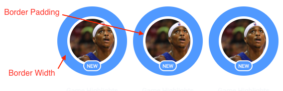
myRowCircleTheme.layoutStyle.borderWidth = 20 // <Number>
myRowCircleTheme.layoutStyle.borderRadius = '50%' // <String>
myRowCircleTheme.layoutStyle.borderPadding = 5 // <Number>
Statuses
Status Unread/Read Style
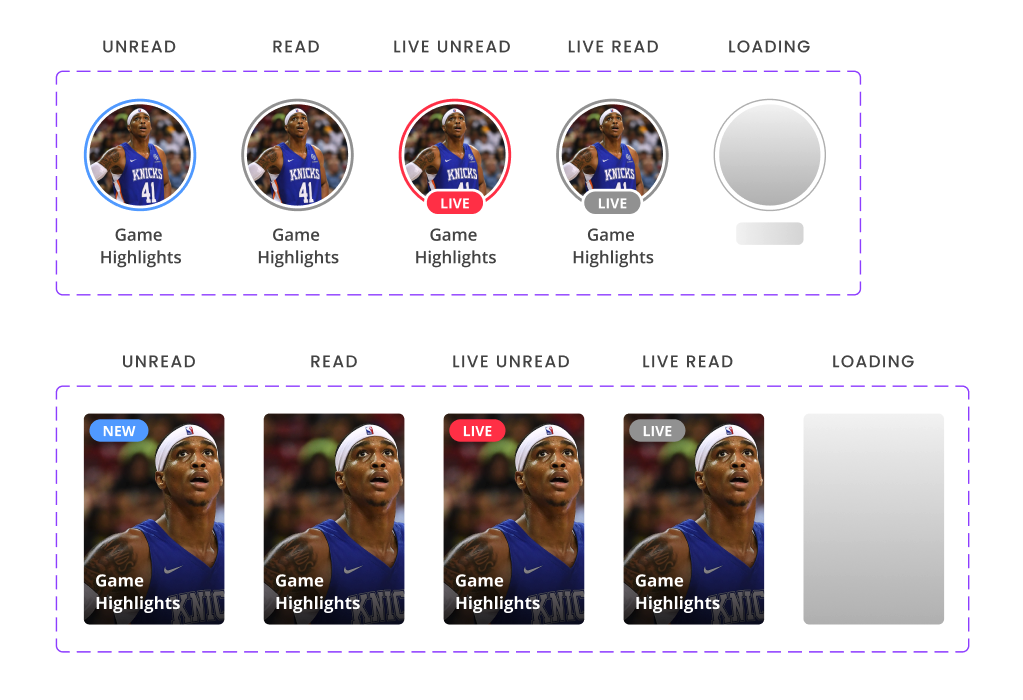
Items are categorized into 4 types of statuses.
- Unread - Live
myRowCircleTheme.layoutStyle.statusLiveUnreadStyle.<CSS_ATTRIBUTE> = <CSS_VALUE> - Unread - Not live
myRowCircleTheme.layoutStyle.statusUnreadStyle.<CSS_ATTRIBUTE> = <CSS_VALUE> - Read - Live
myRowCircleTheme.layoutStyle.statusLiveStyle.<CSS_ATTRIBUTE> = <CSS_VALUE> - Read - Not Live
myRowCircleTheme.layoutStyle.statusReadStyle.<CSS_ATTRIBUTE> = <CSS_VALUE>
This is how each one will be displayed by default:
From left to right, the sequence is as follows: Unread Not Live, Read Not Live, Unread Live, Read Live, and Loading ( cannot style the loading status)
Here, we will cover/divide all the available style properties
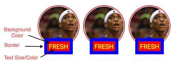
myRowCircleTheme.layoutStyle.horizontalItemsSpacing = 30 // <Number>
myRowCircleTheme.layoutStyle.statusUnreadStyle.backgroundColor = '#FF0000' // String (hex or by name)
myRowCircleTheme.layoutStyle.statusUnreadStyle.textColor = '#FFFF00' // String (hex or by name)
myRowCircleTheme.layoutStyle.statusUnreadStyle.textSize = '20px' // String (pixels)
myRowCircleTheme.layoutStyle.statusUnreadStyle.borderRadius = '0px' // String (pixels)
myRowCircleTheme.layoutStyle.statusUnreadStyle.borderWidth = 10 // Number
myRowCircleTheme.layoutStyle.statusUnreadStyle.borderColor = "#0000FF"  // String (pixels)
myRowCircleTheme.layoutStyle.statusUnreadStyle.text = "FRESH" // String
myRowCircleTheme.layoutStyle.statusUnreadStyle.thumbnailBorderColor = "red" // String
Stream-Specific Status Indicators (NEW)
In addition to the read/unread statuses, video content with live streaming support has two additional status indicators:
5. Upcoming Stream (Scheduled/Waiting Room)
myRowCircleTheme.layoutStyle.statusUpcomingStyle.<CSS_ATTRIBUTE> = <CSS_VALUE>6. Ended Stream (Replay Available)
myRowCircleTheme.layoutStyle.statusEndedStyle.<CSS_ATTRIBUTE> = <CSS_VALUE>Default Appearance:
- Upcoming: Gray chip with "UPCOMING" text
- Live: Red chip with "LIVE" text (existing behavior, already documented)
- Ended: Gray chip with "ENDED" text
Customizing Stream Status Indicators
Stream status indicators support the same customization properties as the existing read/unread status types (backgroundColor, textColor, textSize, borderRadius, borderWidth, borderColor, text, thumbnailBorderColor, font, letterSpacing, padding, isVisible):
// Customize Upcoming Stream indicator
myRowCircleTheme.layoutStyle.statusUpcomingStyle.backgroundColor = '#FFA500';
myRowCircleTheme.layoutStyle.statusUpcomingStyle.textColor = '#FFFFFF';
myRowCircleTheme.layoutStyle.statusUpcomingStyle.text = 'STARTS SOON';
myRowCircleTheme.layoutStyle.statusUpcomingStyle.thumbnailBorderColor = '#FFA500';
myRowCircleTheme.layoutStyle.statusUpcomingStyle.isVisible = true;

// Customize Ended Stream indicator
myRowCircleTheme.layoutStyle.statusEndedStyle.backgroundColor = '#666666';
myRowCircleTheme.layoutStyle.statusEndedStyle.textColor = '#FFFFFF';
myRowCircleTheme.layoutStyle.statusEndedStyle.text = 'REPLAY';
myRowCircleTheme.layoutStyle.statusEndedStyle.thumbnailBorderColor = '#666666';
myRowCircleTheme.layoutStyle.statusEndedStyle.isVisible = true;
Start Time Badge (Upcoming Streams Only)
Upcoming streams can display a countdown timer badge showing when the stream will start:
myRowCircleTheme.layoutStyle.startTimeStyle.isVisible = true;
myRowCircleTheme.layoutStyle.startTimeStyle.backgroundColor = 'rgba(0, 0, 0, 0.7)';
myRowCircleTheme.layoutStyle.startTimeStyle.textColor = '#FFFFFF';
myRowCircleTheme.layoutStyle.startTimeStyle.fontSize = '12px';
myRowCircleTheme.layoutStyle.startTimeStyle.font = "'Roboto', sans-serif";
myRowCircleTheme.layoutStyle.startTimeStyle.fontWeight = 'bold';
myRowCircleTheme.layoutStyle.startTimeStyle.padding = '4px 8px';
myRowCircleTheme.layoutStyle.startTimeStyle.borderRadius = '4px';
myRowCircleTheme.layoutStyle.startTimeStyle.letterSpacing = '0.5px';
myRowCircleTheme.layoutStyle.startTimeStyle.position = 'insideBottom';
Position: The start time badge can be positioned anywhere on the thumbnail using the same position values documented in the Label positioning section above (for example, insideBottom, outsideTop, etc.).
Format:
- Shows relative time: "in 2 hours", "in 30 minutes", "Tomorrow at 3:00 PM"
- Auto-updates as the start time approaches
- Disappears when stream goes live
Complete Example: Customizing All Stream Status Types
const myTheme = BlazeSDK.Theme('row-rectangle', 'video');

// Customize Upcoming status
myTheme.layoutStyle.statusUpcomingStyle.backgroundColor = '#FFA500';
myTheme.layoutStyle.statusUpcomingStyle.textColor = '#FFFFFF';
myTheme.layoutStyle.statusUpcomingStyle.text = 'STARTS SOON';
myTheme.layoutStyle.statusUpcomingStyle.thumbnailBorderColor = '#FFA500';
myTheme.layoutStyle.statusUpcomingStyle.isVisible = true;

// Customize Ended status
myTheme.layoutStyle.statusEndedStyle.backgroundColor = '#666666';
myTheme.layoutStyle.statusEndedStyle.textColor = '#FFFFFF';
myTheme.layoutStyle.statusEndedStyle.text = 'REPLAY';
myTheme.layoutStyle.statusEndedStyle.thumbnailBorderColor = '#666666';
myTheme.layoutStyle.statusEndedStyle.isVisible = true;

// Show start time for upcoming streams
myTheme.layoutStyle.startTimeStyle.isVisible = true;
myTheme.layoutStyle.startTimeStyle.backgroundColor = 'rgba(0, 0, 0, 0.7)';
myTheme.layoutStyle.startTimeStyle.textColor = '#FFFFFF';
myTheme.layoutStyle.startTimeStyle.position = 'insideBottom';
myTheme.layoutStyle.startTimeStyle.padding = '4px 8px';
myTheme.layoutStyle.startTimeStyle.borderRadius = '4px';
Badge Style
The badge status indicator is an additional feature alongside other status indicators and can coexist with them. By default, it is hidden.
// Enable badge visibility and customize its appearance
myRowCircleTheme.layoutStyle.badgeIndicatorStyle.isVisible = true;
myRowCircleTheme.layoutStyle.badgeIndicatorStyle.width = 30;
myRowCircleTheme.layoutStyle.badgeIndicatorStyle.height = 30;
myRowCircleTheme.layoutStyle.badgeIndicatorStyle.borderRadius = '50%';
myRowCircleTheme.layoutStyle.badgeIndicatorStyle.padding = '0';
myRowCircleTheme.layoutStyle.badgeIndicatorStyle.borderColor = '#000';
myRowCircleTheme.layoutStyle.badgeIndicatorStyle.borderWidth = 2;
myRowCircleTheme.layoutStyle.badgeIndicatorStyle.backgroundImage = 'url.png';
myRowCircleTheme.layoutStyle.badgePosition = 'outsideTopRight';

// Option to add margin of the badge final position
myRowCircleTheme.layoutStyle.badgeIndicatorStyle.positionOffset = {
     top: '5px',
     right: '5px'
}
Badge images from the CMS
A content item can carry its own badge image, set per item in the CMS. The image comes with the content data, so there is no SDK option to turn it on. When an item has a badge image, the widget shows it in that item's badge position, even if badgeIndicatorStyle.isVisible is false. Items without a badge image follow badgeIndicatorStyle as usual.
Badge images appear in row and grid widgets for stories, moments, and videos.
- Size and shape: the image fills the badge, so
width,height, andborderRadiusset its size and shape. With the default theme, that's a 24 x 24 px circle. - Border, text, and icon:
borderWidth,borderColor,text, andiconrender on top of the image. SetborderWidthto0to show the image without the default 2 px border. - Fallback: if the item's image fails to load and
isVisibleistrue, the badge usesbadgeIndicatorStyle.backgroundImageinstead. - Loading and errors: the badge stays empty until an image loads, and stays empty if none loads. The widget keeps the badge's space either way, so thumbnails don't shift.
// Size and shape the badge image. Items without one keep the theme badge hidden.
myRowCircleTheme.layoutStyle.badgeIndicatorStyle.width = 32;
myRowCircleTheme.layoutStyle.badgeIndicatorStyle.height = 32;
myRowCircleTheme.layoutStyle.badgeIndicatorStyle.borderRadius = '50%';
myRowCircleTheme.layoutStyle.badgeIndicatorStyle.borderWidth = 0;
myRowCircleTheme.layoutStyle.badgePosition = 'outsideTopRight';
If you build a custom widget, each item's image URL is available as badgeImageUrl.
Skeleton
To improve the UX, we provided an ability to add a gray skeleton on each widget item
myRowCircleTheme.layoutStyle.skeleton = true;Thumbnail Type
You have 3 types of thumbnails to use:
myRowCircleTheme.layoutStyle.thumbnailType = 'SQUARE_ICON'
myRowCircleTheme.layoutStyle.thumbnailType = 'VERTICAL_TWO_BY_THREE';
myRowCircleTheme.layoutStyle.thumbnailType = 'CUSTOM';
Animated Thumbnails
The animated presets (row-circle-animated and row-rectangle-animated) play GIF thumbnails. Set layoutStyle.animatedThumbnail.isEnabled to false to turn animation off while keeping the preset's layout.
const myAnimatedTheme = BlazeSDK.Theme('row-circle-animated', 'story');
myAnimatedTheme.layoutStyle.animatedThumbnail = { isEnabled: false };
Updated 2 days ago