
SwiftUI - Widgets iOS
SwiftUI iOS widgets integration guide
There are suite of SwiftUI widgets to streamline the integration of Stories and Moments in various widget layouts. These widgets bridge traditional UIKit views with the SwiftUI framework, ensuring flexibility while leveraging the power of SwiftUI.
- BlazeSwiftUIStoriesGridWidgetView - This represents a Blaze widget UIViewRepresentable for Stories with a grid layout on a vertical axis.
- BlazeSwiftUIStoriesRowWidgetView - This represents a Blaze widget UIViewRepresentable for Stories with a row layout on a horizontal axis.
- BlazeSwiftUIMomentsGridWidgetView - This represents a Blaze widget UIViewRepresentable for moments with a grid layout on a vertical axis.
- BlazeSwiftUIMomentsRowWidgetView - This represents a Blaze widget UIViewRepresentable for moments with a row layout on a horizontal axis.
- BlazeSwiftUIVideosGridWidgetView - This represents a Blaze widget UIViewRepresentable for videos with a grid layout on a vertical axis.
- BlazeSwiftUIVideosRowWidgetView - This represents a Blaze widget UIViewRepresentable for videos with a row layout on a horizontal axis.
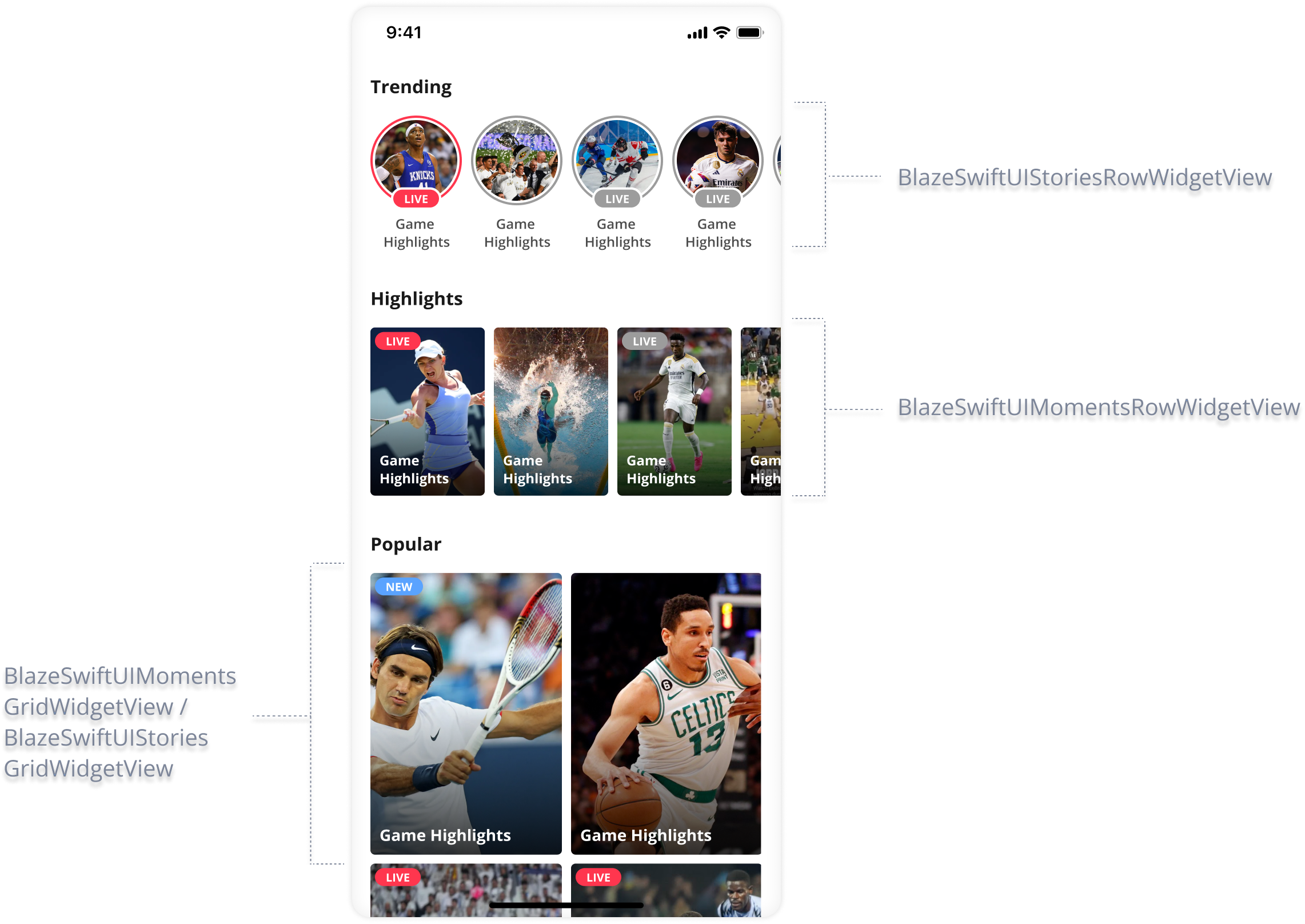
Widgets will notify if any data exists for displayWidget doesn't provide empty state UI display.
Developers must decide on proper logic for the empty state.
Implementation
Prerequisites
- Ensure SwiftUI is compatible with your project.
Widget Initialization
Stories Row
public init(viewModel: BlazeSwiftUIStoriesWidgetViewModel)Stories Grid
public init(viewModel: BlazeSwiftUIStoriesWidgetViewModel)Moments Row
public init(viewModel: BlazeSwiftUIMomentsWidgetViewModel)Moments Grid
public init(viewModel: BlazeSwiftUIMomentsWidgetViewModel)Videos Row
public init(viewModel: BlazeSwiftUIVideosWidgetViewModel)Videos Grid
public init(viewModel: BlazeSwiftUIVideosWidgetViewModel)Properties
viewModel
Stories
public let viewModel: BlazeSwiftUIStoriesWidgetViewModelRepresenting the view model that configures the Blaze Stories Widget's behavior and appearance. You can modify this property or its properties to change the widget's configuration. Read more about the configuration options available under the 'configurations' section.
Moments
public let viewModel: BlazeSwiftUIMomentsWidgetViewModelRepresenting the view model that configures the Blaze Moments Widget's behavior and appearance. You can modify this property or its properties to change the widget's configuration. Read more about the configuration options available under the 'configurations' section.
Videos
public let viewModel: BlazeSwiftUIVideosWidgetViewModelRepresenting the view model that configures the Blaze Videos Widget's behavior and appearance. You can modify this property or its properties to change the widget's configuration. Read more about the configuration options available under the 'configurations' section.
Presets
For a list of available widget layout presets please read here
Handling Widget State: WidgetViewModel
WidgetViewModelThe primary conduit for the widget's state. It provides a suite of functions allowing to have control over the widget's data, behavior and appearance.
Creation
Stories: BlazeSwiftUIStoriesWidgetViewModel
BlazeSwiftUIStoriesWidgetViewModelInitializes a BlazeSwiftUIStoriesWidgetViewModel with the provided widget configuration and story appearance.
Parameters:
-
widgetConfiguration: The configuration settings for the Blaze Stories Widget.
-
storyPlayerStyle: The style settings for Stories within the widget. (Optional)
-
delegate: The delegate event handler for the widget. (Optional)
-
adsConfigType: This property controls the advertisement configuration for Blaze Stories. Defaults to .firstAvailableAdsConfig
-
onWidgetItemClickHandler: Closure to determine handling of widget click events, returning
BlazeWidgetItemClickHandlerStateto guide action. Defaults to SDK's predefined behavior ifnil.
Note: Use this initializer to create a view model for the Blaze Stories Widget with specific configuration and appearance settings.
init(widgetConfiguration: BlazeSwiftUIWidgetConfiguration,
                storyPlayerStyle: BlazeStoryPlayerStyle? = nil,
                delegate: BlazeWidgetDelegate? = nil,
                adsConfigType: BlazeStoriesAdsConfigType = .firstAvailableAdsConfig,
                onWidgetItemClickHandler: (() -> BlazeWidgetItemClickHandlerState)? = nil)
Initializes a BlazeSwiftUIStoriesWidgetViewModel with the specified data source type and layout.
Parameters:
-
dataSourceType: The data source type for the Blaze Stories Widget.
-
layout: The layout configuration for the widget.
-
delegate: The delegate event handler for the widget. (Optional)
-
onWidgetItemClickHandler: Closure to determine handling of widget click events, returning
BlazeWidgetItemClickHandlerStateto guide action. Defaults to SDK's predefined behavior ifnil.
Note: Use this initializer to create a view model with specific data source type and layout settings. You can further customize the widget's behavior and appearance.
init(dataSourceType: BlazeDataSourceType,
                layout: BlazeWidgetLayout,
                delegate: BlazeWidgetDelegate? = nil,
onWidgetItemClickHandler: (() -> BlazeWidgetItemClickHandlerState)? = nil)Moments: BlazeSwiftUIMomentsWidgetViewModel
BlazeSwiftUIMomentsWidgetViewModelInitializes a BlazeSwiftUIMomentsWidgetViewModel with the specified configuration.
Parameters:
-
widgetConfiguration: The configuration settings for the Blaze SwiftUI widget.
-
momentsStyle: The style settings specific to Blaze Moments Player. (Optional)
-
momentsPlaybackConfiguration: The playback configuration settings specific to Blaze Moments Player. (Optional)
-
delegate: The delegate event handler for the widget. (Optional)
-
adsConfigType: This property controls the advertisement configuration for Blaze Moments. Defaults to .firstAvailableAdsConfig
-
onWidgetItemClickHandler: Closure to determine handling of widget click events, returning
BlazeWidgetItemClickHandlerStateto guide action. Defaults to SDK's predefined behavior ifnil.
init(widgetConfiguration: BlazeSwiftUIWidgetConfiguration,
                momentsStyle: BlazeMomentsPlayerStyle? = nil,
                momentsPlaybackConfiguration: BlazeMomentsPlaybackConfiguration? = nil,
                delegate: BlazeWidgetDelegate? = nil,
                adsConfigType: BlazeMomentsAdsConfigType = .firstAvailableAdsConfig,
                onWidgetItemClickHandler: (() -> BlazeWidgetItemClickHandlerState)? = nil)
Initializes a BlazeSwiftUIMomentsWidgetViewModel with a specified data source type and layout.
Parameters:
-
dataSourceType: The data source type for the Blaze widget.
-
layout: The layout configuration for the Blaze widget.
-
momentsPlaybackConfiguration: The playback configuration settings specific to Blaze Moments Player. (Optional)
-
delegate: The delegate event handler for the widget. (Optional)
-
onWidgetItemClickHandler: Closure to determine handling of widget click events, returning
BlazeWidgetItemClickHandlerStateto guide action. Defaults to SDK's predefined behavior ifnil.
init(dataSourceType: BlazeDataSourceType,
                layout: BlazeWidgetLayout,
                momentsPlaybackConfiguration: BlazeMomentsPlaybackConfiguration? = nil,
                delegate: BlazeWidgetDelegate? = nil,
onWidgetItemClickHandler: (() -> BlazeWidgetItemClickHandlerState)? = nil)Videos: BlazeSwiftUIVideosWidgetViewModel
BlazeSwiftUIVideosWidgetViewModelInitializes a BlazeSwiftUIVideosWidgetViewModel with the specified configuration.
Parameters:
- widgetConfiguration: The configuration settings for the Blaze SwiftUI widget.
- videosPlayerStyle: The style settings specific to Blaze Videos. (Optional)
- videosPlaybackConfiguration: The playback configuration settings specific to Blaze Videos. (Optional)
- delegate: The delegate event handler for the widget. (Optional)
- adsConfigType: This property controls the advertisement configuration for Blaze Videos. Defaults to .firstAvailableAdsConfig
- onWidgetItemClickHandler: Closure to determine handling of widget click events, returning
BlazeWidgetItemClickHandlerStateto guide action. Defaults to SDK's predefined behavior ifnil.
init(widgetConfiguration: BlazeSwiftUIWidgetConfiguration,
     videosPlayerStyle: BlazeVideosPlayerStyle? = nil,
     videosPlaybackConfiguration: BlazeVideosPlaybackConfiguration? = nil,
     delegate: BlazeWidgetDelegate? = nil,
     adsConfigType: BlazeVideosAdsConfigType = .firstAvailableAdsConfig,
     onWidgetItemClickHandler: (() -> BlazeWidgetItemClickHandlerState)? = nil)
Example:
// Create playback configuration
var playbackConfig = BlazeVideosPlaybackConfiguration.base()
playbackConfig.multiAspectRatio = true
playbackConfig.shouldOpenInLandscape = true

// Initialize view model with playback configuration
let viewModel = BlazeSwiftUIVideosWidgetViewModel(
    widgetConfiguration: BlazeSwiftUIWidgetConfiguration(
        layout: BlazeWidgetLayout.Presets.Videos.Grid.medium,
        dataSourceType: .labels(.singleLabel("highlights")),
        widgetIdentifier: "videos-grid-highlights"
    ),
    videosPlaybackConfiguration: playbackConfig
)

// Use with SwiftUI view
BlazeSwiftUIVideosGridWidgetView(viewModel: viewModel)
Initializes a BlazeSwiftUIVideosWidgetViewModel with a specified data source type and layout.
Parameters:
- dataSourceType: The data source type for the Blaze widget.
- layout: The layout configuration for the Blaze widget.
- delegate: The delegate event handler for the widget. (Optional)
- onWidgetItemClickHandler: Closure to determine handling of widget click events, returning
BlazeWidgetItemClickHandlerStateto guide action. Defaults to SDK's predefined behavior ifnil.
Note: Use this initializer to create a view model with specific data source type and layout settings. You can further customize the widget's playback behavior by setting the videosPlaybackConfiguration property after initialization.
init(dataSourceType: BlazeDataSourceType,
     layout: BlazeWidgetLayout,
     delegate: BlazeWidgetDelegate? = nil,
     onWidgetItemClickHandler: (() -> BlazeWidgetItemClickHandlerState)? = nil)
Example:
// Initialize with simple parameters
var viewModel = BlazeSwiftUIVideosWidgetViewModel(
    dataSourceType: .labels(.singleLabel("highlights")),
    layout: BlazeWidgetLayout.Presets.Videos.Row.medium
)

// Configure playback after initialization
var playbackConfig = BlazeVideosPlaybackConfiguration.base()
playbackConfig.multiAspectRatio = true
viewModel.videosPlaybackConfiguration = playbackConfig

// Use with SwiftUI view
BlazeSwiftUIVideosRowWidgetView(viewModel: viewModel)
Methods
BlazeSwiftUIMomentsWidgetViewModel & BlazeSwiftUIStoriesWidgetViewModel expose several public methods:
reloadData
method signature
public func reloadData(progressType: BlazeProgressType)Reload the widget's data in current configuration using the provided progress type for the loading process.
Parameters:
- progressType:
BlazeProgressType
updateDataSource
method signature
public mutating func updateDataSourceType(_ dataSourceType: BlazeDataSourceType, progressType: BlazeProgressType)Updates the dataSourceType and Reloads the data for the widget using the provided progress type for the loading process.
Parameters:
- dataSourceType:
BlazeDataSourceType - progressType:
BlazeProgressType
setLayout
method signature
public mutating func setLayout(_ layout: BlazeWidgetLayout)Sets and reloads the layout of the widget immediately after.
Parameters:
- layout:
BlazeWidgetLayout
updateWidgetsUI
method signature
func updateWidgetsUI()Updates the user interface of the widget(s) managed by this class. This method is responsible for applying any pending changes to the widgets' appearances, including style overrides, or layout adjustments.
updateOverrideStyle
method signature
func updateOverrideStyle(_ style: BlazeWidgetItemStyleOverrides?,
												 for itemCustomMapping: BlazeWidgetItemCustomMapping,
                         shouldUpdateUI: Bool = true)
Updates the style override for a single item within the widget based on a custom mapping and optionally refreshes the widget's UI to reflect the change.
This method allows for dynamic customization of an item's appearance by applying a new style override or removing an existing one. If nil is passed as the style, any existing override for the specified item will be removed.
Accessing and modifying this method must be performed on the main thread to ensure UI consistency and avoid race conditions. Failure to do so may result in undefined behavior, including crashes or UI glitches.
Parameters:
- style: An optional
BlazeWidgetItemStyleOverridesobject representing the new style to be applied. Passnilto remove the current override. - itemCustomMapping: A
BlazeWidgetItemCustomMappingobject identifying the item to which the style override should be applied. - shouldUpdateUI: A Boolean value indicating whether the widget's UI should be updated immediately to reflect the style change. The default is
true.
Usage:
let customMapping = BlazeWidgetItemCustomMapping(key: "playerId", value: "12345")
let newStyle = BlazeWidgetItemStyleOverrides(statusIndicator: statusIndicatorOverrides, imageBorder: imageBorderOverrides)
widgetView.updateOverrideStyle(newStyle, for: customMapping)
This example updates the style for an item identified by a specific player ID and immediately refreshes the widget's UI to display the changes.
updateOverrideStyles
method signature
func updateOverrideStyles(stylesPerItem: [BlazeWidgetItemCustomMapping: BlazeWidgetItemStyleOverrides?],
													shouldUpdateUI: Bool = true)
Updates style overrides for multiple items within the widget based on custom mappings and optionally refreshes the widget's UI to reflect these changes.
This method supports bulk updates to the styles of multiple items, allowing for efficient customization of the widget's appearance. Similar to updateOverrideStyle, passing nil as a style for an item removes the existing override for that item.
Accessing and modifying this method must be performed on the main thread to ensure UI consistency and avoid race conditions. Failure to do so may result in undefined behavior, including crashes or UI glitches.
Parameters:
- stylesPerItem: A dictionary mapping
BlazeWidgetItemCustomMappingobjects to optionalBlazeWidgetItemStyleOverrides. Each key-value pair specifies the
custom mapping for an item and the new style to be applied. Passnilas the value to remove the current override for the corresponding item. - shouldUpdateUI: A Boolean value indicating whether the widget's UI should be updated immediately to reflect the style changes. The default is
true.
Usage:
let customMapping1 = BlazeWidgetItemCustomMapping(key: "playerId", value: "12345")
let customMapping2 = BlazeWidgetItemCustomMapping(key: "gameId", value: "67890")
let style1 = BlazeWidgetItemStyleOverrides(badge: badgeOverrides)
let style2 = BlazeWidgetItemStyleOverrides(imageBorder: imageBorderOverrides)
widgetView.updateOverrideStyles(stylesPerItem: [customMapping1: style1, customMapping2: style2])
This example updates the styles for items identified by specific player and game IDs, immediately refreshing the widget's UI to display the changes.
resetOverriddenStyles
method signature
func resetOverriddenStyles()Resets any existing style overrides stored in perItemStyleOverrides, and updates the Widget's UI.
play
method signature
func play()Calls the widget to play its contents, starting from the first item.
Use this method to manually play a widget's content that has been successfully preloaded.
Automatically dismisses any player instance that is being presented by the app, and replaces it.
Manually callingplayon a widget means you gain control and the responsibility to call this method only after the widget'sonDataLoadCompletehas been called successfully. Otherwise, the widget has no content to play, and calling this function will have no effect.
play(from: BlazeWidgetPlayFrom)
method signature
func play(from: BlazeWidgetPlayFrom)Calls the widget to play its contents, starting from the specified position. Use this method to manually play a widget's content from a specific position.
Use this method to manually play a widget's content that has been successfully preloaded.
Automatically dismisses any player instance that is being presented by the app, and replaces it.
Manually callingplayon a widget means you gain control and the responsibility to call this method only after the widget'sonDataLoadCompletehas been called successfully. Otherwise, the widget has no content to play, and calling this function will have no effect.
Properties
widgetConfiguration
var widgetConfiguration: BlazeSwiftUIWidgetConfigurationRepresenting the configuration settings for the Widget. You can modify this property or its properties to change the widget's configuration. Read more about the configuration options available under the 'configurations' section.
delegate
public weak var delegate: BlazeWidgetDelegate?An optional handler for delegate events in a given Blaze Widget. Read more about available delegate events
storyPlayerStyle
var storyPlayerStyle: BlazeStoryPlayerStyle?Overrides the story appearance of the player for the specific widget. You can modify this property or its properties to change and override the default player style. Read more about the customization options available under the 'Story Player Customizations' section.
momentsPlayerStyle
var momentsPlayerStyle: BlazeMomentsPlayerStyle?Overrides the moments appearance of the player for the specific widget. You can modify this property or its properties to change and override the default player style. Read more about the customization options available under the 'Customizations' section.
Stories adsConfigType
var adsConfigType: BlazeStoriesAdsConfigTypeThis property manages the advertisement configuration for Blaze Stories. Its default behavior is to adhere to the first ad configuration established for the entire app. If a matching configuration is not found, the default behavior is to fallback to a state where no ads are displayed (none).
Moments adsConfigType
var adsConfigType: BlazeMomentsAdsConfigTypeThis property manages the advertisement configuration for Blaze Moments. Its default behavior is to adhere to the first ad configuration established for the entire app. If a matching configuration is not found, the default behavior is to fallback to a state where no ads are displayed (none).
onWidgetItemClickHandler
var onWidgetItemClickHandler: (() -> BlazeWidgetItemClickHandlerState)?Closure to determine handling of widget click events, returning BlazeWidgetItemClickHandlerState to guide action. Defaults to SDK's predefined behavior if nil.
Usage:
widgetView.onWidgetItemClickHandler = {
 return condition ? .handledByApp : .sdkShouldHandle
 }
Usage:
widgetView.onWidgetItemClickHandler = {
 return condition ? .handledByApp : .sdkShouldHandle
 }
Updated 2 months ago