
Widgets iOS
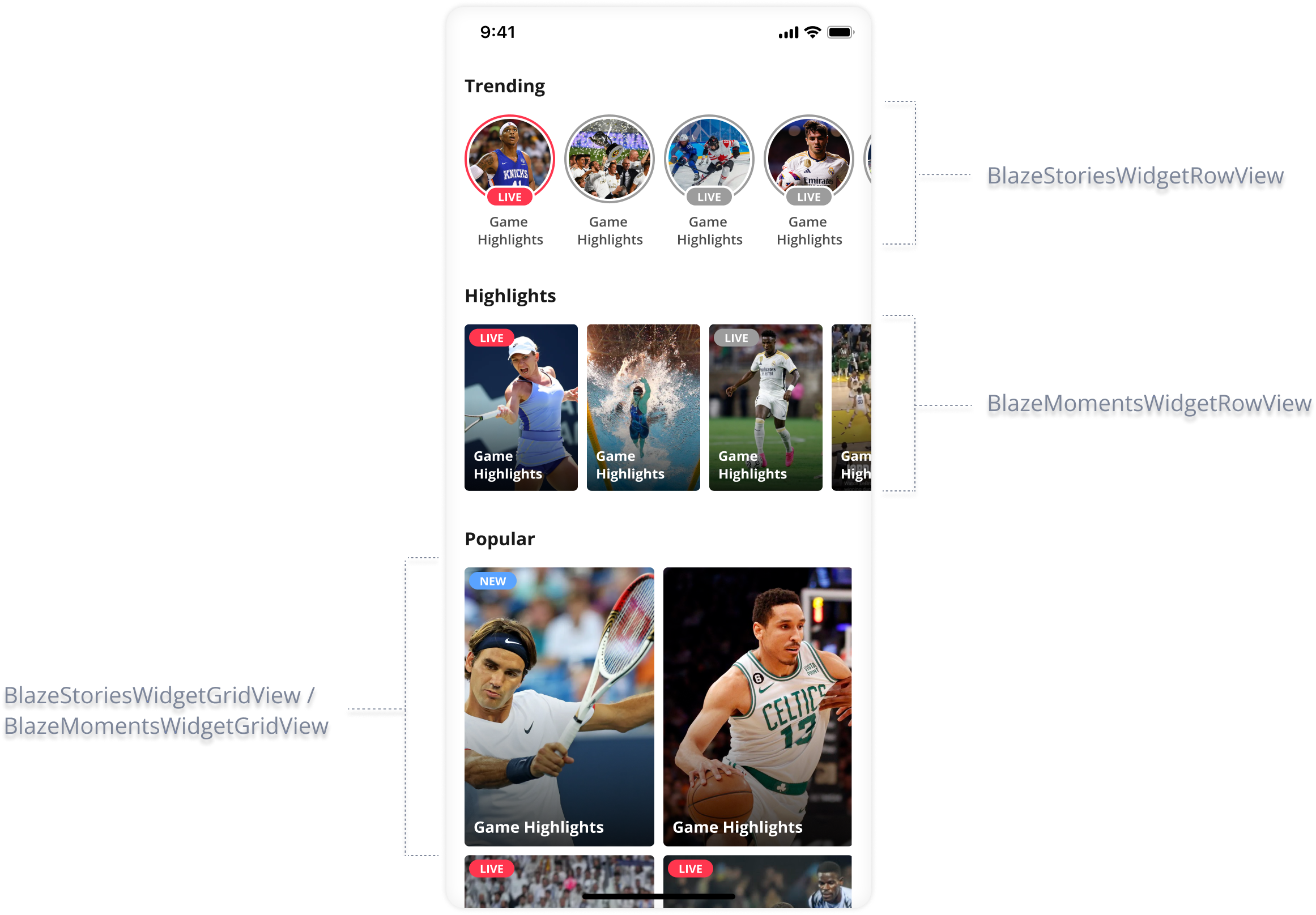
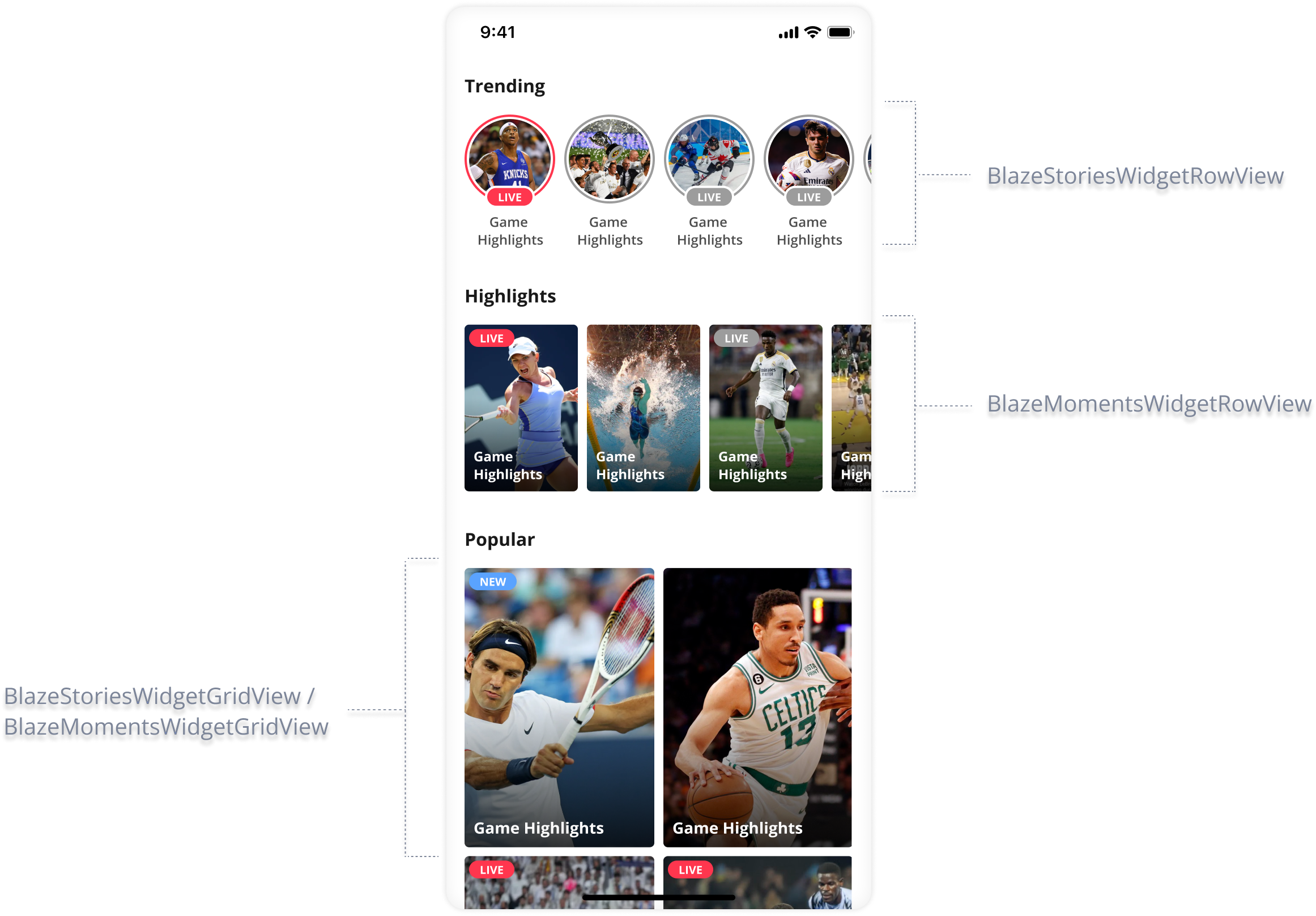
Different types of widgets can be integrated:
- Stories grid: Stories in a grid layout (vertical axis)
- Stories row: Stories in a row layout (horizontal axis)
- Moments grid: Moments in a grid layout (vertical axis)
- Moments row: Moments in a row layout (horizontal axis)
- Videos grid: Videos in a grid layout (vertical axis)
- Videos row: Videos in a row layout (horizontal axis)
Empty state logic
Consider that widget notify if any data exists for display. Widgets don't provide empty state UI display. You must decide on the logic for the empty state.
Implementation
Widget Initialization
The following show the initialization for each widget layout type.
Stories Row
let rowWidget = BlazeStoriesWidgetRowView(layout: layout)
rowWidget.dataSourceType = .labels(.singleLabel(labels))
// An optional helper method to embed the widget view in your own view.
// This method adds the current `BlazeWidgetView` as a subview to the provided `View` and applies full frame constraints to it.
rowWidget.embedInView(viewToEmbedRowView)

rowWidget.reloadData(progressType: .skeleton)
Stories Grid
let gridWidget = BlazeStoriesWidgetGridView(layout: layout)
gridWidget.dataSourceType = .labels(.singleLabel(labels))
// An optional helper method to embed the widget view in your own view.
// This method adds the current `BlazeWidgetView` as a subview to the provided `View` and applies full frame constraints to it.
gridWidget.embedInView(viewToEmbedRowView)

gridWidget.reloadData(progressType: .skeleton)
Moments Row
let rowWidget = BlazeMomentsWidgetRowView(layout: layout)
rowWidget.dataSourceType = .labels(.singleLabel(labels))
// An optional helper method to embed the widget view in your own view.
// This method adds the current `BlazeWidgetView` as a subview to the provided `View` and applies full frame constraints to it.
rowWidget.embedInView(viewToEmbedRowView)

rowWidget.reloadData(progressType: .skeleton)
Moments Grid
let gridWidget = BlazeMomentsWidgetGridView(layout: layout)
gridWidget.dataSourceType = .labels(.singleLabel(labels))
// An optional helper method to embed the widget view in your own view.
// This method adds the current `BlazeWidgetView` as a subview to the provided `View` and applies full frame constraints to it.
gridWidget.embedInView(viewToEmbedRowView)

gridWidget.reloadData(progressType: .skeleton)
Videos Row
let rowWidget = BlazeVideosWidgetRowView(layout: layout)
rowWidget.dataSourceType = .labels(.singleLabel(labels))
// An optional helper method to embed the widget view in your own view.
// This method adds the current `BlazeWidgetView` as a subview to the provided `View` and applies full frame constraints to it.
rowWidget.embedInView(viewToEmbedRowView)

rowWidget.reloadData(progressType: .skeleton)
Videos Grid
let gridWidget = BlazeVideosWidgetGridView(layout: layout)
gridWidget.dataSourceType = .labels(.singleLabel(labels))
// An optional helper method to embed the widget view in your own view.
// This method adds the current `BlazeWidgetView` as a subview to the provided `View` and applies full frame constraints to it.
gridWidget.embedInView(viewToEmbedRowView)

gridWidget.reloadData(progressType: .skeleton)
Customizing Layout and Style
The BlazeWidgetView object lets you configure properties to create a completely customizable experience.
layout
var layout: BlazeWidgetLayout- Defines the visual layout of the widget.
- More options are set out in Customizations.
Example: Customizing badge and status colors
Add this snippet immediately after defining the layout and before initializing the widget view.
This ensures your visual overrides are applied to the layout before the widget loads.
// MAIN THREAD ONLY
var layout = BlazeWidgetLayout.Presets.Stories.Row.circles

layout.widgetItemStyle.statusIndicator.isVisible = true
layout.widgetItemStyle.badge.unreadState.isVisible = true
layout.widgetItemStyle.badge.readState.isVisible = true

// Use safe dynamic colors (light/dark mode aware)
let unreadBG = UIColor.systemBlue
let readBG: UIColor = trait.userInterfaceStyle == .dark ? .systemGray4 : .systemGray5

let statusBG = UIColor.systemGreen

layout.widgetItemStyle.badge.unreadState.backgroundColor = unreadBG
layout.widgetItemStyle.badge.readState.backgroundColor   = readBG
layout.widgetItemStyle.statusIndicator.backgroundColor   = statusBG

// Recommended: explicit text colors
layout.widgetItemStyle.badge.unreadState.textColor = .white
layout.widgetItemStyle.badge.readState.textColor   = .label

// Apply layout to widget
let widgetView = BlazeStoriesWidgetRowView(layout: layout)
widgetView.widgetIdentifier = "home.stories.row.circles"
widgetView.dataSourceType = .labels(.singleLabel(labels))
widgetView.reloadData(progressType: .skeleton)
If you modify the layout after initializing widgetView, call reloadLayout() to apply updates.**
storyPlayerStyle
var storyPlayerStyle: BlazeStoryPlayerStyleOverrides the story style of the player for the specific widget. You can modify this property or its properties to change and override the default player style. Read more about the customization options available under the 'Story Player Customizations' section.
momentsPlayerStyle
var momentsPlayerStyle: BlazeMomentsPlayerStyleOverrides the moments style of the player for the specific widget. You can modify this property or its properties to change and override the default player style. Read more about the customization options available under the 'Customizations' section.
videosPlayerStyle
var videosPlayerStyle: BlazeVideosPlayerStyleOverrides the videos style of the player for the specific widget. You can modify this property or its properties to change and override the default player style. Read more about the customization options available under the 'Customizations' section.
Stories adsConfigType
var adsConfigType: BlazeStoriesAdsConfigTypeThis property manages the advertisement configuration for Blaze Stories.
Its default behavior is to adhere to the first ad configuration established for the entire app.
If a matching configuration is not found, the default behavior is to fallback to a state where no ads are displayed (none).
Moments adsConfigType
var adsConfigType: BlazeMomentsAdsConfigTypeThis property manages the advertisement configuration for Blaze Moments.
Its default behavior is to adhere to the first ad configuration established for the entire app.
If a matching configuration is not found, the default behavior is to fallback to a state where no ads are displayed (none).
Videos adsConfigType
var adsConfigType: BlazeVideosAdsConfigTypeThis property manages the advertisement configuration for Blaze Videos.
Its default behavior is to adhere to the first ad configuration established for the entire app.
If a matching configuration is not found, the default behavior is to fallback to a state where no ads are displayed (none).
widgetIdentifier
Starting November 2025, regard population of this property as being mandatory.
var widgetIdentifier: String?A required string that uniquely identifies the widget instance within your integration. This identifier is critical for tracking, analytics, and accurate attribution of widget performance data.
If this property isn't set:
- The system can't detect the source location of event data.
- Reports dependent on location-based segmentation—such as "performance by location"—will be unavailable.
widgetRemoteIdentifier
var widgetRemoteIdentifier: String?The widgetRemoteIdentifier property represents the remote identifier of the Blaze widget. Defaults to nil.
When a widget with this identifier exists in the CMS, the widget derives its layout (UI) and data source from there.
dataSourceType
var dataSourceType: BlazeDataSourceTypeThe dataSourceType property represents the dataSourceType associated with the Blaze widget. dataSourceType is built with BlazeDataSourceType
Representing the dataSourceType applied to the widget. Modify this property to alter the dataSourceType used for filtering stories.
Options:
- labels - This value can be a simple single value or a logical expression built using 'MustInclude' and 'AtLeastOneOf' operators to build more complex filters. Use BlazeWidgetLabel for creating the expression.
- ids -Specific content id's
Examples:
- .labels(.singleLabel("Real-Madrid")) ---> Only content that conforms "Real-Madrid"
- .labels(.mustInclude("Real-Madrid", "Benzema")) ---> Only content that conforms "Real-Madrid" AND "Benzema"
- .labels(.atLeastOneOf("Real-Madrid", "Liverpool")) ---> Only content that conforms "Real-Madrid" OR "Liverpool"
- .ids(["contentId1"]) ---> Only "contentId1"
- .ids(["contentId1", "contentId2"]) ---> Only "contentId1" and "contentId2"
isScrolledEnabled
var isScrolledEnabled: BoolThis property is indicating if scrolling is enabled for the widget. Modify this property to enable or disable scrolling in the widget. Default value is True.
cachePolicyLevel
var cachePolicyLevel: BlazeCachePolicyLevel?Overrides the cachePolicyLevel for the specific widget. Read more about the options available under the 'BlazeCachePolicyLevel' section.
isEmbededInScrollView
var isEmbededInScrollView: Bool The isEmbededInScrollView property indicates whether the widget should automatically adjust its size. This property is useful when a vertically- scrolling Widget is embedded inside a UIScrollView or any UIScrollView subclass, as it allows the Widget to adjust its size according to its content
refreshControl
var refreshControl: UIRefreshControl?The refreshControl property represents the refresh control associated with a single Blaze widget.
widgetDelegate
weak var widgetDelegate: BlazeWidgetDelegate?The widgetDelegate property represents the delegate object for the Blaze widget.
shouldOrderWidgetByReadStatus
var shouldOrderWidgetByReadStatus: BoolA flag to indicate whether items should be ordered by their read status. For interaction with advanced order and the difference between reordering and filtering read content, see Ordering and item limits.
When this flag is set to true, the widget will display items in an order where unread items appear first, followed by the read items.
When this flag is set to false, read/unread does not change item order.
Note:
- This flag is
trueby default. - If all of the items have been viewed, the original order of the items will be maintained.
perItemStyleOverrides
var perItemStyleOverrides: [BlazeWidgetItemCustomMapping: BlazeWidgetItemStyleOverrides]A dictionary property that maps BlazeWidgetItemCustomMapping instances to BlazeWidgetItemStyleOverrides. This mapping enables the application of custom style overrides to individual items within the widget based on specified criteria or attributes.
The keys in this dictionary are instances of BlazeWidgetItemCustomMapping, which consist of custom key-value pairs. These pairs define specific criteria or attributes for which the corresponding BlazeWidgetItemStyleOverrides should be applied. For example, a custom mapping could be defined to apply a unique style to all items related to a specific game ID or player ID.
The values in the dictionary are BlazeWidgetItemStyleOverrides instances. Each BlazeWidgetItemStyleOverrides instance specifies how the item's appearance should be customized. This allows for detailed customization of item styles within the widget, enhancing the visual diversity and relevance of the widget's content.
Accessing and modifying this property must be performed on the main thread to ensure UI consistency and avoid race conditions. Failure to do so may result in undefined behavior, including crashes or UI glitches.
Usage:
widgetView.perItemStyleOverrides = [
BlazeWidgetItemCustomMapping(key: "playerId", value: "12345"): BlazeWidgetItemStyleOverrides(statusIndicator: statusIndicatorOverrides, imageBorder: imageBorderOverrides, badge: badgeOverrides),
BlazeWidgetItemCustomMapping(keyPreset: .gameId, value: "67890"): BlazeWidgetItemStyleOverrides(statusIndicator: statusIndicatorOverrides, imageBorder: imageBorderOverrides, badge: badgeOverrides)]
This example shows how perItemStyleOverrides can be used to apply specific style overrides to widget items based on player ID and game ID, respectively. Each item matching the custom mapping criteria will have its style customized according to the defined BlazeWidgetItemStyleOverrides.
videosPlaybackConfiguration
var videosPlaybackConfiguration: BlazeVideosPlaybackConfiguration?Overrides the playback configuration for the specific widget. This property controls playback behavior such as aspect ratio handling and screen orientation, which are separate from visual styling.
You can modify this property to customize how videos behave during playback, including:
- Multi-aspect ratio support: Automatically selects the optimal aspect ratio based on device orientation
- Landscape orientation: Force rotation to landscape when entering fullscreen from portrait
Read more about the available configuration options under the Video Playback Configuration section.
Example:
let widgetView = BlazeVideosWidgetView(layout: layout)

// Create and customize playback configuration
var playbackConfig = BlazeVideosPlaybackConfiguration.base()
playbackConfig.multiAspectRatio = true
playbackConfig.shouldOpenInLandscape = true

// Apply to the widget
widgetView.videosPlaybackConfiguration = playbackConfig
widgetView.dataSourceType = .labels(.singleLabel(labels))
widgetView.reloadData(progressType: .skeleton)
onWidgetItemClickHandler
var onWidgetItemClickHandler: (() -> BlazeWidgetItemClickHandlerState)?A Closure to determine handling of widget click events, returning BlazeWidgetItemClickHandlerState to guide action. Defaults to SDK's predefined behavior if nil.
Usage:
widgetView.onWidgetItemClickHandler = {
 return condition ? .handledByApp : .sdkShouldHandle
 }
Methods
setup as init
method signature
init(layout: BlazeWidgetLayout, cachePolicyLevel: BlazeCachePolicyLevel? = nil, perItemStyleOverrides: [BlazeWidgetItemCustomMapping: BlazeWidgetItemStyleOverrides] = [:]) {Sets up the widget with the specified layout and cache policy level.
Parameters:
- layout: The layout configuration for the Blaze widget.
- cachePolicyLevel: The cache policy level for the Blaze widget. Default is
nil. - perItemStyleOverrides: A dictionary property that maps
BlazeWidgetItemCustomMappinginstances toBlazeWidgetItemStyleOverrides. This mapping enables the application of custom style overrides to individual items within the widget based on specified criteria or attributes. Default isNo Overrides.
setup as method after init
method signature
func setup(with layout: BlazeWidgetLayout, cachePolicyLevel: BlazeCachePolicyLevel? = nil, perItemStyleOverrides: [BlazeWidgetItemCustomMapping: BlazeWidgetItemStyleOverrides] = [:]) {Sets up the widget with the specified layout and cache policy level.
Parameters:
- layout: The layout configuration for the Blaze widget.
- cachePolicyLevel: The cache policy level for the Blaze widget. Default is
nil. - perItemStyleOverrides: A dictionary property that maps
BlazeWidgetItemCustomMappinginstances toBlazeWidgetItemStyleOverrides. This mapping enables the application of custom style overrides to individual items within the widget based on specified criteria or attributes. Default isNo Overrides.
reloadData
method signature
func reloadData(progressType: BlazeProgressType)Reloads the data of the Blaze widget with the specified progress type.
Parameters:
- progressType: The progress type for the data reload.
updateDataSourceType
method signature
func updateDataSourceType(dataSourceType: BlazeDataSourceType, progressType: BlazeProgressType)Updates the dataSourceType and Reloads the data for the widget with the specified progress type.
Parameters:
- progressType: The progress type to indicate the reloading progress.
- dataSourceType: BlazeDataSourceType
[BlazeDataSourceType](https://dev.wsc-sports.com/docs/ios-blazedatasourcetype)
reloadLayout
method signature
func reloadLayout()Reloads the layout of the Blaze widget.
embedInView
method signature
func embedInView(_ superview: UIView)Optional helper method.
Embeds the current BlazeWidgetView in a given UIView.
This method adds the current BlazeWidgetView as a subview to the provided UIView and applies full frame constraints to it.
Parameter:
- superview: The
UIViewin which to embed the currentBlazeWidgetView.
updateWidgetsUI
method signature
func updateWidgetsUI()Updates the user interface of the widget(s) managed by this class. This method is responsible for applying any pending changes to the widgets' style, including style overrides, or layout adjustments.
updateOverrideStyle
method signature
func updateOverrideStyle(_ style: BlazeWidgetItemStyleOverrides?,
												 for itemCustomMapping: BlazeWidgetItemCustomMapping,
                         shouldUpdateUI: Bool = true)
Updates the style override for a single item within the widget based on a custom mapping and optionally refreshes the widget's UI to reflect the change.
This method allows for dynamic customization of an item's style by applying a new style override or removing an existing one. If nil is passed as the style, any existing override for the specified
item will be removed.
Accessing and modifying this method must be performed on the main thread to ensure UI consistency and avoid race conditions. Failure to do so may result in undefined behavior, including crashes or UI glitches.
Parameters:
- style: An optional
BlazeWidgetItemStyleOverridesobject representing the new style to be applied. Passnilto remove the current override. - itemCustomMapping: A
BlazeWidgetItemCustomMappingobject identifying the item to which the style override should be applied. - shouldUpdateUI: A Boolean value indicating whether the widget's UI should be updated immediately to reflect the style change. The default is
true.
Usage:
let customMapping = BlazeWidgetItemCustomMapping(key: "playerId", value: "12345")
let newStyle = BlazeWidgetItemStyleOverrides(statusIndicator: .init(...), imageBorder: .init(...))
widgetView.updateOverrideStyle(newStyle, for: customMapping)
This example updates the style for an item identified by a specific player ID and immediately refreshes the widget's UI to display the changes.
updateOverrideStyles
method signature
func updateOverrideStyles(stylesPerItem: [BlazeWidgetItemCustomMapping: BlazeWidgetItemStyleOverrides?],
													shouldUpdateUI: Bool = true)
Updates style overrides for multiple items within the widget based on custom mappings and optionally refreshes the widget's UI to reflect these changes.
This method supports bulk updates to the styles of multiple items, allowing for efficient customization of the widget's style. Similar to updateOverrideStyle, passing nil as a style
for an item removes the existing override for that item.
Accessing and modifying this method must be performed on the main thread to ensure UI consistency and avoid race conditions. Failure to do so may result in undefined behavior, including crashes or UI glitches.
Parameters:
- stylesPerItem: A dictionary mapping
BlazeWidgetItemCustomMappingobjects to optionalBlazeWidgetItemStyleOverrides. Each key-value pair specifies the
custom mapping for an item and the new style to be applied. Passnilas the value to remove the current override for the corresponding item. - shouldUpdateUI: A Boolean value indicating whether the widget's UI should be updated immediately to reflect the style changes. The default is
true.
Usage:
let customMapping1 = BlazeWidgetItemCustomMapping(key: "playerId", value: "12345")
let customMapping2 = BlazeWidgetItemCustomMapping(key: "gameId", value: "67890")
let style1 = BlazeWidgetItemStyleOverrides(badge: badgeOverrides)
let style2 = BlazeWidgetItemStyleOverrides(imageBorder: imageBorderOverrides)
widgetView.updateOverrideStyles(stylesPerItem: [customMapping1: style1, customMapping2: style2])
This example updates the styles for items identified by specific player and game IDs, immediately refreshing the widget's UI to display the changes.
resetOverriddenStyles
method signature
func resetOverriddenStyles()Resets any existing style overrides stored in perItemStyleOverrides, and updates the Widget's UI.
play
method signature
func play()Calls the widget to play its contents, starting from the first item.
Use this method to manually play a widget's content that has been successfully preloaded.
Automatically dismisses any player instance that is being presented by the app, and replaces it.
Manually callingplayon a widget means you gain control and the responsibility to call this method only after the widget'sonDataLoadCompletehas been called successfully. Otherwise, the widget has no content to play, and calling this function will have no effect.
play(from: BlazeWidgetPlayFrom)
method signature
func play(from: BlazeWidgetPlayFrom)Calls the widget to play its contents, starting from the specified position. Use this method to manually play a widget's content from a specific position.
Use this method to manually play a widget's content that has been successfully preloaded.
Automatically dismisses any player instance that is being presented by the app, and replaces it.
Manually callingplayon a widget means you gain control and the responsibility to call this method only after the widget'sonDataLoadCompletehas been called successfully. Otherwise, the widget has no content to play, and calling this function will have no effect.
Widget Delegate Methods
BlazeWidgetDelegate is a struct that implements BlazePlayerSourceDelegate defining the handlers closures that receive callbacks from Row and Grid widgets to allow your app to handle various type of events.
ThesourceIdrepresentswidgetIdentifier
You can implement the following methods:
onWidgetDataLoadStarted
No Longer Available: Use BlazePlayerSourceDelegate.onDataLoadStarted instead
onWidgetDataLoadComplete
No Longer Available: Use BlazePlayerSourceDelegate.onDataLoadComplete instead
onWidgetItemClicked
method signature
/**
- widgetId: The ID of the widget containing the clicked item.
- widgetItemId: The ID of the clicked item within the widget.
- widgetItemTitle: The title of the clicked item, if available. This parameter is optional.
*/
public typealias OnWidgetItemClickedHandler = ((widgetId: String, widgetItemId: String, widgetItemTitle: String?)) -> Void

/**
Called when an item within the widget is clicked.
*/
public var onWidgetItemClicked: OnWidgetItemClickedHandler?
Called when an item within the widget is clicked.
Parameters:
- widgetId: The ID of the widget containing the clicked item.
- widgetItemId: The ID of the clicked item within the widget.
- widgetItemTitle: The title of the clicked item, if available. This parameter is optional.
onWidgetPlayerDismissed
Deprecated: Use BlazePlayerSourceDelegate.onPlayerDidDismiss instead
onTriggerCTA
Deprecated: Use BlazePlayerSourceDelegate.onTriggerCTA instead
Updated 21 days ago