
BlazeWidgetLayout - React Native
The BlazeWidgetLayout struct is a part of the BlazeSDK and is responsible for defining the layout properties and appearance of the widget items in a BlazeWidgetView.
Properties
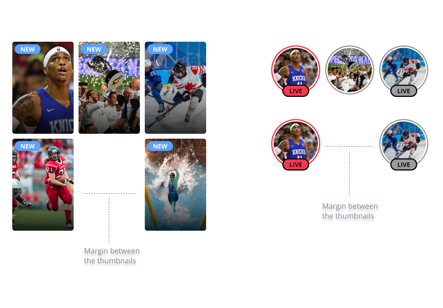
horizontalItemsSpacing
horizontalItemsSpacing?: numberSets the horizontal spacing between items in the widget
verticalItemsSpacing
verticalItemsSpacing?: numberSets the vertical spacing between items
Applies to Grid Widget only
itemRatio
itemRatio?: numberA number representing the aspect ratio of the widget items. The default value is 2/3 (2:3 ratio). In row widgets, the height is fixed by the container, and the width is calculated based on the ratio. In grid widgets, the width is fixed by the container, and the height is dynamically calculated.
margins
margins?: BlazeMarginsAn BlazeMargins representing the space between the container and the items.
columns
columns?: numberAn Int representing the number of columns in a grid layout.
The default value is 2.
Applies only for Grid Widget
maxDisplayItemsCount
maxDisplayItemsCount?: numberAn optional number representing the maximum number of items allowed to be presented in the widget. The default value is nil, which allows for an infinite number of items.
shimmering
shimmering?: BlazeWidgetShimmeringStyleCustomizes the skeleton animation shown while widget content is loading.
baseColor sets the placeholder background color, and highlightColor sets the brightest color in the moving gradient. Both fields accept #RRGGBB or #AARRGGBB hex strings. If a value is missing or malformed, the SDK uses the native default.
const blazeWidgetLayout: BlazeWidgetLayout = {
  shimmering: {
    baseColor: '#1F2937',
    highlightColor: '#374151',
  },
};
widgetItemStyle
widgetItemStyle?: BlazeWidgetItemStyle = { ... }A BlazeWidgetItemStyle object that defines the style settings for the widget items.
isScrollEnabled
isScrollEnabled?: booleanis Horizontal Scroll allowed on widget
Usage
To create an instance of BlazeWidgetLayout, you can either use the default values or provide your own:
const blazeWidgetLayout: BlazeWidgetLayout = {
  horizontalItemsSpacing: 10,
  verticalItemsSpacing: 10,
  shimmering: {
    baseColor: '#1F2937',
    highlightColor: '#374151',
  },
};

<BlazeMomentsGridView blazeWidgetLayout={blazeWidgetLayout} />
This example creates a custom grid layout.
Updated 2 months ago